Tien Chiu

  • Home
  • About
    • Honors, Awards, and Publications
  • Online Teaching
  • Gallery
  • Essays
  • Book
  • Blog
  • Dye samples
You are here: Home / Archives for design

May 25, 2017 by Tien Chiu

Brainstorming

I had a lovely time in Oregon, teaching my “Power Up Your Process” workshop and giving a talk on brainstorming. I thought I’d share some of the ideas in the talk with you, as I think they address some common misconceptions about brainstorming.

First, brainstorming is NOT about creating a work of art. My brainstormed designs all look like they were drawn by a six year old child. In fact, I’m pretty sure a six-year-old could produce better art, given time. But brainstorming is not about taking time to create a great portrait. Brainstorming is about getting as many ideas as quickly as possible – so whatever captures the idea fastest is the best method for brainstorming. In my case, it’s a fast and largely incoherent scrawl.

To demonstrate, here are a few of the brainstormed designs for my piece “Goodbye, Ma,” plus the finished piece.

I knew I wanted a phoenix rising out of something, so I started with some thumbnail sketches to show different poses for the bird. Each of these took only a few seconds, and I didn’t stop to think or adjust details. The sketches are crude, but they were perfect for the occasion, giving me a collection of ideas in just a few minutes.

cropped thumbnails for Goodbye, Ma

Next I took some of my favorite poses and sketched them roughly in black and white. Each sketch took less than a minute.

Thumbnail sketches for my piece "Goodbye, Ma"
Thumbnail sketches for my piece “Goodbye, Ma”

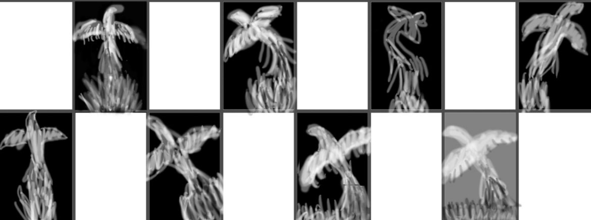
Next I took some of my ideas and developed them a little more. Here are a few variants, each of which took about 5-10 minutes:

phoenix brainstorming - rising from flames
phoenix brainstorming – rising from flames
phoenix brainstorming - rising from black hole
phoenix brainstorming – rising from black hole

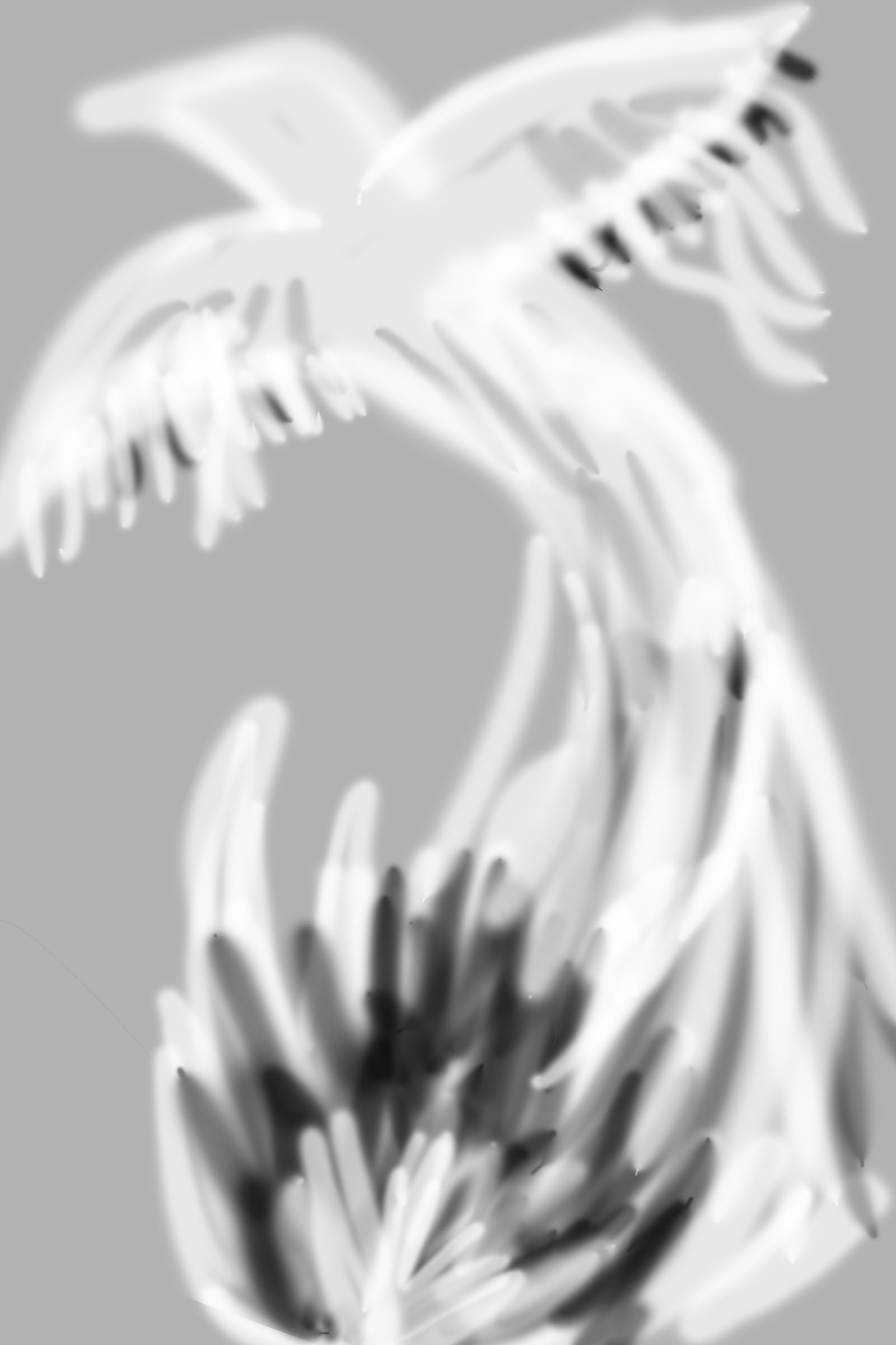
After I was done brainstorming, I started developing the piece. Here’s the first iteration – just the overall pose and a hint of shading:

initial development of phoenix drawing

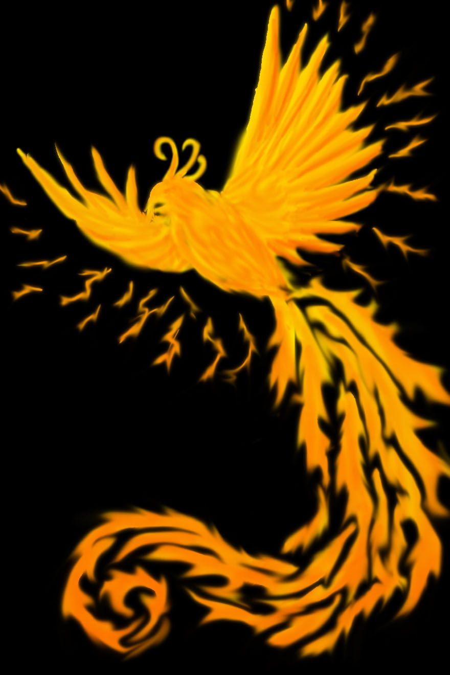
After doing that version, I added some shading, and added some blue to “pop” the oranges.

second iteration - light and shadow
second iteration – light and shadow, complementary color

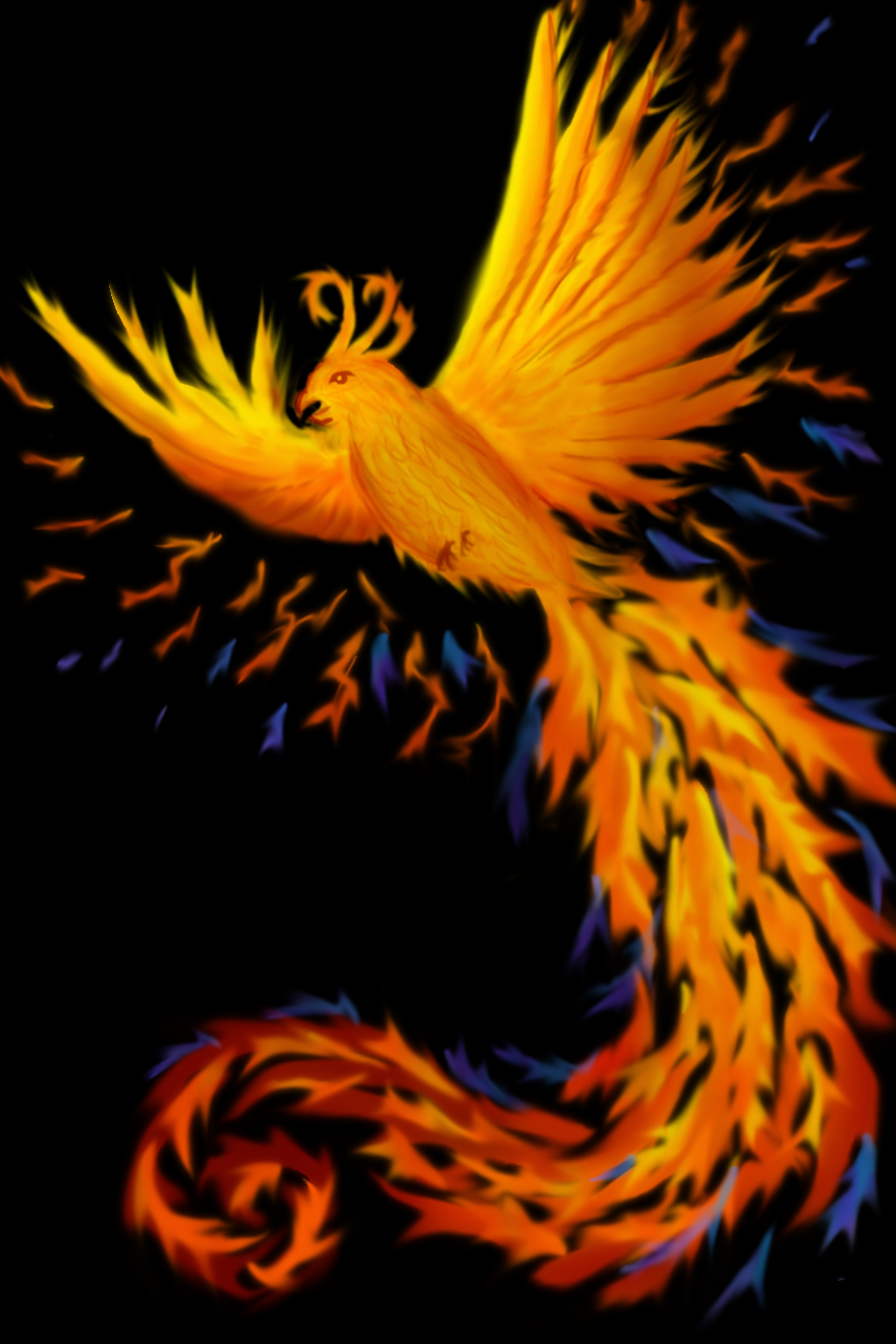
Around this point I realized that it would be great to have the phoenix flying out of a cremation urn, rather than just appearing out of nowhere. So I added a crude sketch to check positioning, and also changed the wing feathers around a bit, experimenting.

phoenix - flying up from urn
phoenix – flying up from urn

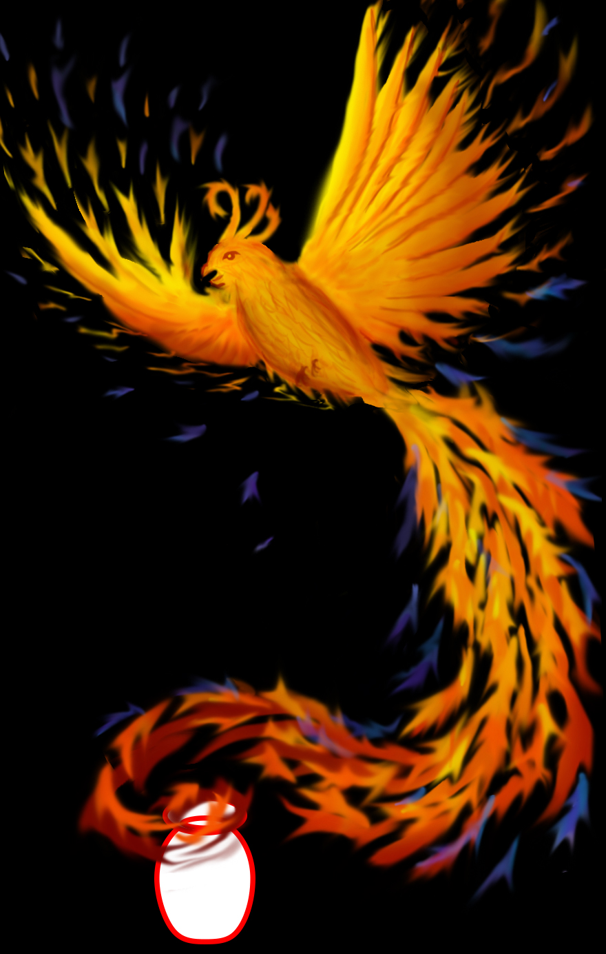
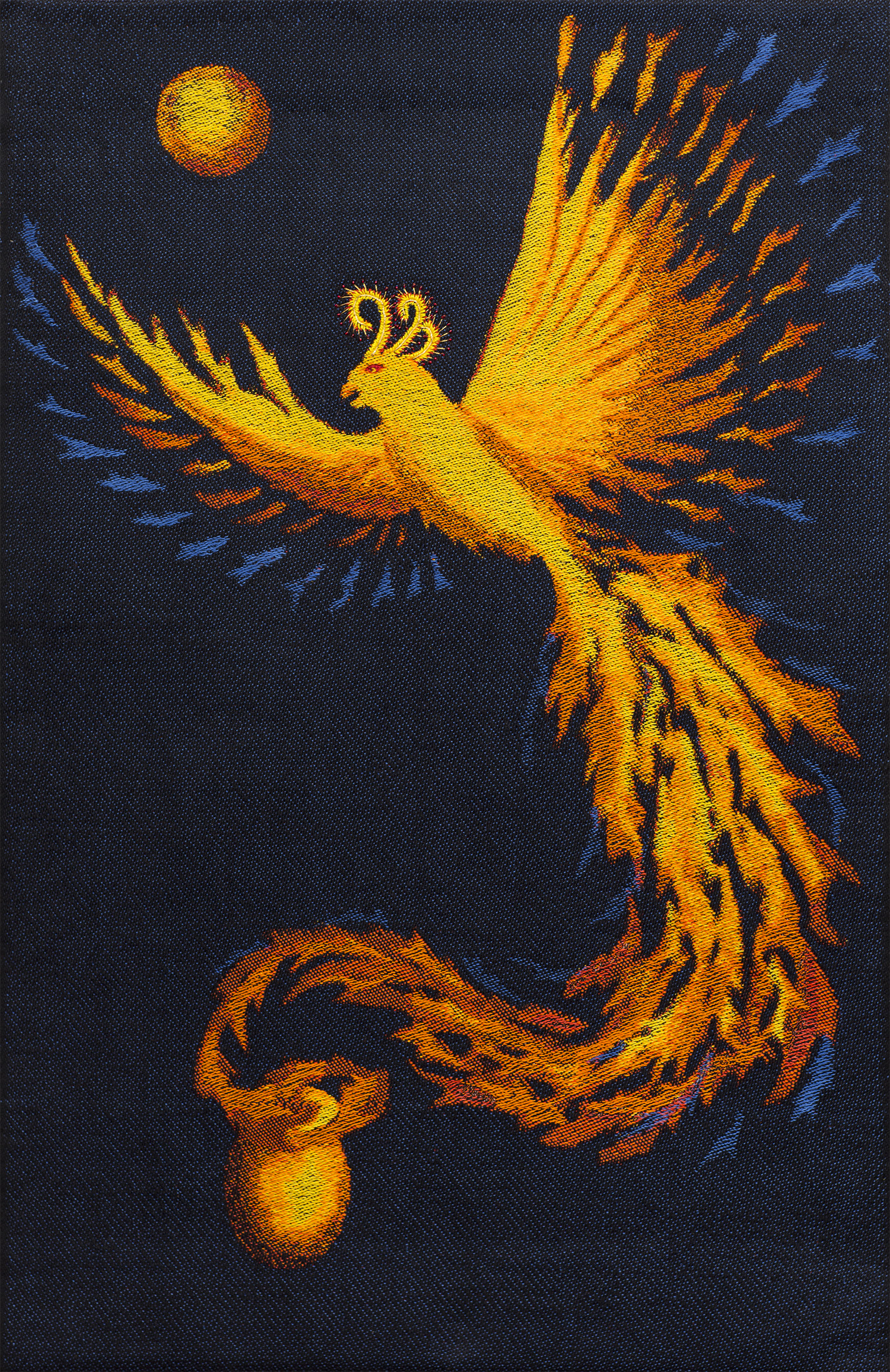
Having checked the positioning, I drew in the urn and re-revised the wings to look a bit more fiery:

phoenix with a better-drawn cremation urn

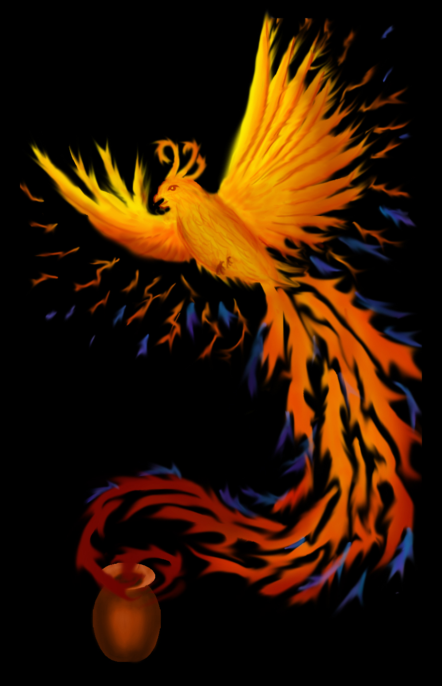
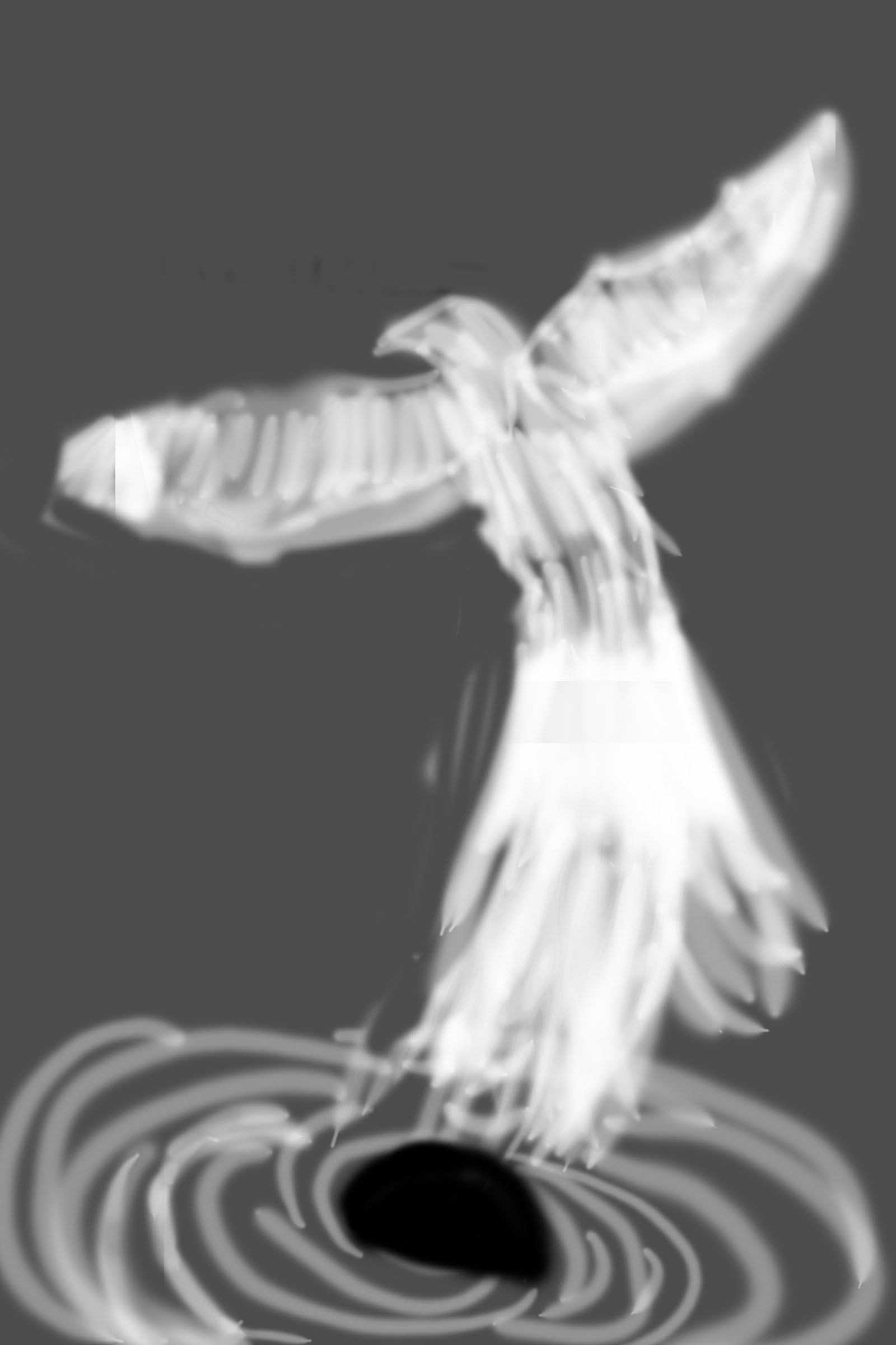
I felt that the piece needed something to indicate that the phoenix was flying upwards, so I added a moon. I also straightened out the feathers and made them more stylistically compatible with the tail:

phoenix with added moon

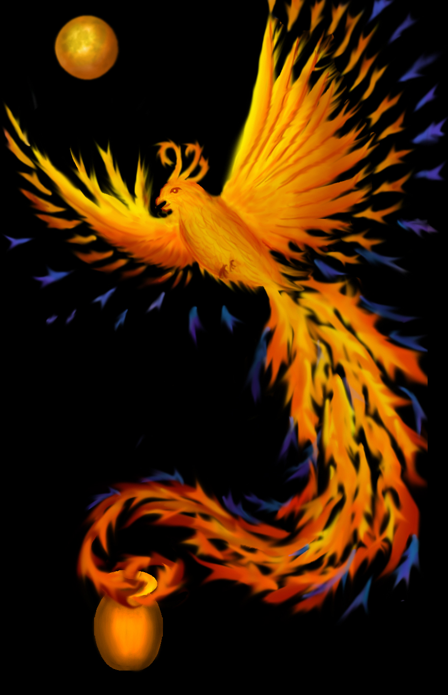
And in the final iteration, I decided to remove the feet, and made the blue feathers more plentiful. Here is the final drawing for “Goodbye, Ma”:

final sketch for Goodbye, Ma

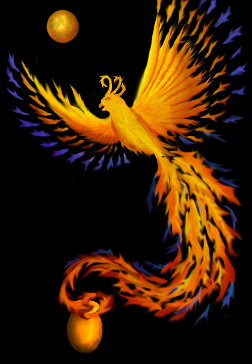
And here is the finished piece:

"Goodbye, Ma"
“Goodbye, Ma”

Coming back to the start again, here is the first brainstormed sketch:

cropped thumbnails for Goodbye, Ma

I used to despair because my brainstormed sketches looked so crude. But now I’ve realized that that’s exactly what they should be. The idea is to test many ideas, so you can select the best one to develop further. Childish scrawls are perfect.

Filed Under: All blog posts, textiles, weaving, meditations on craft Tagged With: brainstorming, design

January 6, 2017 by Tien Chiu

iOrnament: possibly the coolest app ever

I have found the app of my dreams.

Remember how I said I wanted to design a series of shawls and scarves such that each shawl would be unique, but they wouldn’t take forever to design? Well, a week or two ago I discovered iOrnament: an app for iOS that allows you to generate beautiful designs more or less instantly. As you draw a line in the app, it’s immediately transformed according to your choice of 17 symmetries, and retiled across the plane.

Here’s a design I sketched up in the app. It took about fifteen minutes:

Simple design sketched up in iOrnament

As you zoom out, you can see the design tiled across the plane, at whatever size you like:

iOrnament design tiled across the plane

With the touch of an icon, you can see other variations of your design under different symmetries:

design under P4 symmetry
design under Pmg symmetry
design under P6 symmetry

If you spring for the Premium version (a whopping 99 cents extra), you get a bunch of cool stuff. You can see your design on a sphere, again with your choice of underlying symmetries. Here’s a five-fold symmetry on the sphere:

design on a sphere
design on a sphere

And here’s a slightly different symmetry on the sphere:

second variant on a sphere

And a tiled version within a circle:

circle version of design

You can also do rotational 2 or 3-color symmetries, with just a tap on an icon:

color symmetries
color symmetries

This is all with a very simple design. Far more sophisticated artwork is possible with iOrnament – for a stunningly beautiful gallery, visit the iOrnament website.

“Okay,” you say, “but what does this have to do with weaving?”

Well, here’s a mockup I made in Photoshop, using a brush defined from the pattern, and then simulated on a black warp with a turquoise-to-fuchsia gradient weft:

quick Photoshop design using the tile as a brush

And of course there are many other design options using Photoshop.

The entire design process took less than an hour, and produced a result that can easily be taken into Arahweave and turned into an attractive, unique, handwoven shawl design. I’m sold!

And best of all, iOrnament costs a whopping $3.99 (premium upgrade 99 cents). It’s written by Jürgen Richter-Gebert, a math professor at the Technical University of Munich. He says, “The amazing fact about these kind of programs is that everyone starting from a three year old child to an highly intellectual adult can at the same time be creative, have fun with them and learn something about mathematical structures….I try to combine mathematics, modern visualization technics and playful approaches to demonstrate that math can be beauty and fun.”

It’s easy to start drawing in iOrnament – you can create beautiful designs with just your finger as soon as you open the program. (The bells and whistles do take a little longer.) But if you want to delve deeper into the mathematics, the app explains the seventeen underlying symmetries, and there’s more information on the website.

I gotta say, this has got to be The. Coolest. App. Ever. The only negative thing I can say about the app is that it’s iOS only, so Android folks are out of luck.

Stay tuned for more wonderful designs as I continue playing with iOrnament…I am winding a warp now in 60/2 silk, 14″ wide, sett for double weave – one layer of black and one layer of white. The plan is to make some scarves using iOrnament-generated designs…so watch this space!

Filed Under: All blog posts, textiles, weaving Tagged With: design

May 22, 2015 by Tien Chiu

Seeking to understand design

I wrote a lengthy essay as part of a discussion on a Caltech alumni mailing list, and thought some of you might find it interesting, so I’ve cleaned it up a bit and am posting it. It’s a bit longer and more theoretical than most of my posts, but I hope you enjoy it.

> The larger issue, and reason I am writing this, is that the wonderful thing about actually making something, be it art or craft or whatever, is that you have to really “see” the thing you are doing to measure the results of your activity… smell the flowers, eat the chocolates, really see the picture…

That is certainly true. The act of making is so complex that without that feedback loop, you make things poorly. But, while being observant will get you there, a good understanding of underlying structure will get you there faster.

For example, color theory is universal. I think of it as the “laws of physics” regarding how the eye behaves. For example, if you put a single dot of bright yellow on an overall dark background, your eye will go first to the yellow dot regardless of what the background design is or what medium is used. Why? Because the eye is drawn to contrast, and the light-colored dot is the spot of greatest contrast. Further, yellow is a very assertive color – it draws the eye very strongly. If you put a light purple dot on the background, your eye would still be drawn to the dot, but not as strongly because purple is a receding color – far less assertive than yellow. Those principles are universal.

The implementation of color theory, though, varies a lot by medium. For example, weaving is all about optical mixing, because (except in certain specialized situations) you have warp crossing weft, and both show on the surfaces. You can arrange the proportions so you have 90% warp on one side, so it looks like almost a solid color, but you still have 10% dots of another color on that side. So if you are weaving lemon yellow and black, the dots of black will cant your yellow towards green (because yellow mixed with black produces olive green).

Learning color theory is separate from putting it into practice. When actually making art, you need to pay close attention to the feedback loop, to check that (empirically) your piece is working. You also need to understand the foibles of your medium. But a generic understanding of how color works, whether consciously learned or developed through working experience, is what teaches you how to design well and fix problems with your color scheme. And while you can develop an intuitive understanding through experience, studying the underlying principles of color is a lot faster.

I have been having an interesting time reading through books on drawing. They seem to fall into two categories: the empirical “draw what you see” (the most famous example being the book Drawing on the Right Side of the Brain by Betty Edwards), and the more theory-based “now this is how perspective works, this is how light and shadow work”. Which approach is better depends on what you want to do. “Draw what you see” is a great way to get a jump-start on drawing actual objects, and can be learned pretty quickly. However, it doesn’t set you up very well for drawing imaginary objects, because you are reproducing what you see without understanding why it looks like that. As a result, after starting with an empirical approach, I’m finding myself looking towards the more theoretical books because they have what I need to “roll my own” in designing imaginary objects. (The best books on theory I’ve found are Scott Robertson and Thomas Bertling’s How to Draw and How to Render.

Similarly, I have been trying to abstract for myself some rules for good design, by observing successful (and not-so-successful) pieces and thinking about what does and doesn’t work.

One of the best pieces of advice I’ve been given was by a weaver with fine arts training: she advised me that a piece should be about one thing, and everything in the piece should support that one idea. It doesn’t have to be a literal idea; the “thing” could be a shape or a line, or it could be exploration of a color. She felt that I had two or three ideas embedded in one piece, and it would have been stronger if I had chosen one and gone with just that. I’m not sure I agree with her about that particular piece, but I can see what she meant, and I think it’s good advice. (Especially for me – I love complexity and have to actively restrain myself from throwing the kitchen sink into a piece.)

Another useful “rule” is that a piece should be as simple as it can be, but not simpler. Got five colors in a piece? Take one out and see if it still works. Got it down to four? See if you can do it with three. If it doesn’t work with three, you know four is what you need.

The applications of these rules can be subtle but have profound implications. For example: good three-dimensional art with complex shape rarely has complex pattern. In particular, intricate shapes tend to be solid colors – think bronze or marble sculpture, complicated origami models, and so on. There is three-dimensional art with complex pattern, but it tends to have simple shapes: ceramic plates or teapots, for example. The more complex the shape, the simpler the visual patterning.

Why is this? I think it’s because of the first rule I mentioned, that a piece should be about a single idea. In the simple shapes, the patterning dominates and is the primary “idea”. In complex shapes, the shape dominates and is the primary “idea”. If you throw complicated shape and complicated patterning into the same piece, you have two ideas clashing for dominance, and the result is visual confusion.

Similarly, I think there’s a reason that the most really complex, demanding patterning is generally two-dimensional (painting, tapestry weaving, etc.). It’s because any element of shape is a distraction from the patterning, and flat two-dimensional is about as simple a shape as you can get. Paintings are (mostly) rectangular because an irregular shape, unless specifically needed for the “idea” of the painting, distracts from the patterning.

The difficulty with abstracting rules is that for virtually every rule, there is a good design that breaks it. So books on design generally limit themselves to discussing the elements of design – rhythm, repetition, contrast, and so on – but don’t give you rules for how to put them together. Which I understand – and it’s a good idea not to, since people are apt to take textbooks as an unquestioned source of truth – but which leaves me flopping around trying to understand what makes a good design. I’d like to understand successful artists’ rules of thumb so I can decide whether they apply to my art and my tastes or not.

Now, my problem is that I want to do patterning on three-dimensional shapes. In particular, I’m interested in combining origami with jacquard-woven imagery on cloth. The two rules I mentioned suggest simple origami shapes, like simple curves rather than a complicated dragon. I can see where you could merge a simple curve with a pattern that complements the curve, but it’s definitely more challenging than working in two-dimensional pattern. As an example, consider this photo of an origami model:

three-dimensional origami bullseye

It’s quite simple: concentric circles in three dimensions. But as simple as it is, it is still complicated enough that a really complex pattern is likely to clash. But if I did a concentric pattern of waves and water drops, that might support an “idea” of ripples on water. I could then modify the origami pattern to look more like irregular ripples, and less like a bullseye, to support that idea. But merging the shape and the pattern to support a single idea, with both pattern and shape necessary to support the idea, is definitely challenging.

I find all this utterly fascinating – good art is well-designed, and design does generally follow rules. One of the things I’m trying to do is establish my own set of working rules, which requires considerably deeper thought than one would expect just by walking through a museum and looking at the pretty things.

Filed Under: All blog posts, musings Tagged With: design

April 13, 2014 by Tien Chiu

Color study: saturation and value

I’ve been getting progressively grumpier over the last several days, as commitment after commitment kept me from doing anything creative. So when I woke up this morning with nothing on the slate, I rushed out to the loom and started weaving on the color study again. This time I was experimenting with saturation and value. (Value = lightness/darkness; high value = light color, low value = dark.)

Here are today’s samples:

high saturation, medium value
Sample 1: high saturation, medium value
sample 2: low saturation, medium value
sample 3: low saturation, low value


sample 4: medium saturation, high value

My iPhone unfortunately did not do the best job with colors, but you can see (more or less) that in the first sample, the motif “HI -” jumps out at you. That’s because orange is an advancing color and thus grabs attention, and also because it is highly saturated against a duller background, which also makes it stand out more.

As the color gets less saturated in sample 2, the motif is less obvious. And in sample 3, the color is quite desaturated (the real thing is less red and more brown) and also quite close to the background in value, so it doesn’t stand out nearly as strongly.

In sample #4, saturation isn’t particularly high, but the motif is a very light color, producing high value contrast with the dark background. As a result, the motif stands out clearly.

I still have 11 sections remaining on the color study. My plan is to continue weaving the same motif, varying the color combinations. I can get 3-4 versions of the motif out of each section, so I have (in theory at least) another 44 possible combinations. I considered changing the design as well as the color combinations, but decided there was plenty to explore just in color variations. Also, it will be much quicker to weave if I don’t have to design everything from scratch every time. I’m eager to get the sea turtle warp onto the loom, and experiment with weaving fine threads on Emmy.

And here is our shoe-sniffing Fritz, demonstrating one of his other vices! He is thoroughly addicted to belly rubs, and has been known to pass out from pure pleasure during a belly-rub session. Here Mike is catering to his addiction:

Fritz getting a belly rub
Fritz in the throes of a belly rub

It’s hard to resist a cat that’s begging for belly rubs!

Filed Under: All blog posts, textiles, weaving Tagged With: color study, design

March 30, 2014 by Tien Chiu

The value of value

The first section of my color study warp was neutral monochromes – black, white, and gray. So I used it to study value.

The first sample I wove was (almost) pure black and white. I wanted to show a section with high value contrast:

woven sample, pure black and white

This is very high contrast, so energetic, but it also has a bit of a sterile feel.

For the second sample, I decided to introduce some grays. (Unfortunately, my grays when dyed came out distinctly blue-tinged, so not quite neutral, but try to ignore that.) Here we are with the second sample:

black, gray, and white, regular striping

Another clean, classic look – but not as stark feeling as the black and white sample.

For the third sample, I introduced a wide range of values by blending white, light gray, medium gray, and black in varying quantities. Since they were randomly placed, the result was rather chaotic:

many shades of gray, producing a jumble of values

This, while chaotic, also has a much more nuanced (and lively) feel than the previous sample, with plenty of diversity in value.

Finally, I decided to do one sample with primarily lighter values and one sample with mainly darker values:

woven sample - white and medium to light gray
woven sample – white and medium to light gray
woven sample - black and dark gray
woven sample – black and dark gray

Here you can see how value affects mood – the first sample has a much “lighter” and more contemplative feel than the second sample, which feels rather dark and moody.

I’ve woven two other sets of samples, which I’ll use to illustrate my Designing Fabrics Study Group article (due tomorrow!). That article will be about the effect of value, particularly value contrast, on perception of color. The main problem I’m having with that article is photography! I have eleven samples to be photographed and converted to black and white, and it’s been remarkably difficult getting the photos to come out true to life. Fortunately my photographer friend Lieven has been helping out with advice, so as soon as the sun comes up, I’m going to reshoot my photos. I have a gray card which will help me keep the colors and values in sync across all eleven samples.

And, since I forgot to include a kitten in my last post (how could I have forgotten such wonderful and engaging creatures?!?), here is a photo with two kittens, practicing yoga on the couch. Stretch kittens! Is that like a stretch limo?

Fritz and Tigress, stretched out on the couch

Filed Under: All blog posts, textiles, weaving Tagged With: color study, color theory, design

Next Page »

Subscribe to Blog via Email

Information resources

  • Dye samples
    • Procion MX fiber-reactive dye samples on cotton
    • How to "read" the dye sample sets
    • Dye sample strategy - the "Cube" method
  • How-Tos
    • Dyeing and surface design
    • Weaving
    • Designing handwoven cloth
    • Sewing

Blog posts

  • All blog posts
    • food
      • chocolate
    • musings
    • textiles
      • dyeing
      • knitting
      • sewing
      • surface design
      • weaving
    • writing

Archives

Photos from my travels

  • Dye samples
    • Procion MX fiber-reactive dye samples on cotton
    • How to "read" the dye sample sets
    • Dye sample strategy - the "Cube" method
  • Travels
    • Thailand
    • Cambodia
    • Vietnam
    • Laos
    • India
    • Ghana
    • China

Travel Blog

Entertaining miscellanies

© Copyright 2016 Tien Chiu · All Rights Reserved ·


Loading Comments...