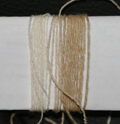
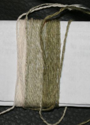
I’ve been designing the samples for my magazine article on color, and have been having fun with yarn wraps and Photoshop. It’s astonishing how color, and proportion of color, impacts the “feel” of a piece. For example, here are combinations of the same three colors, in the same pattern:
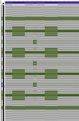
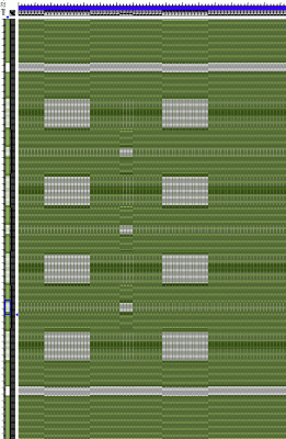
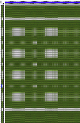
They have totally different “feels”, depending on the amount of each color, and the contrast between colors. The lighter valued (paler) colors feel lighter and brighter (the white is almost garish compared to the other two), the darker colors more sober. The middle one is more subdued, primarily because the sage background doesn’t contrast strongly with either sage or olive, reducing the total contrast in the piece. The bottom one feels powerful and energetic, with the strong contrast between olive and white.
And that’s with only three colors, in monochrome!
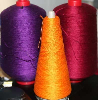
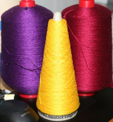
Here is another pair of pictures that illustrate the magic of proportion:
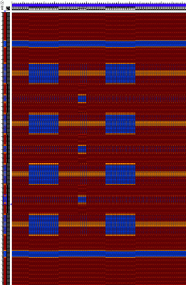
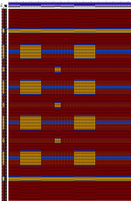
These two also have totally different “feels”, even though all I did was swap the blue and orange-gold colors. The blue is calmer and more conservative, the orange brighter and bolder.
Magic!
