Tien Chiu

  • Home
  • About Tien
  • C.V.
  • Online Teaching
  • Works
  • Essays
  • Travels
  • Book
  • Blog
  • Dye samples
You are here: Home / Archives for gradient colors

June 29, 2010 by Tien Chiu 6 Comments

Unstuck

Lots of good things happened yesterday!

First, the new fans arrived for my AVL compudobby.  They are twice as powerful as the previous fans, so that should be an end to my Compudobby woes.  B. and I will be swapping them out tomorrow night, so I’ll be able to resume threading on Thursday.  Hooray!

Second, the New Munsell Student Color Set that I’d ordered arrived.  This means I can progress on my dye study group.  I’ll get to work on that this morning.

Third, I got confirmation that my custom order of 30/2 silk is being manufactured and should arrive in three weeks, max.  I need that silk to continue progressing on my dye study group, so I’m glad to have that confirmed.  (I ordered a total of 25 kg, for myself and friends, so this is a pretty big deal.)

Fourth, the wedding photographer told me that she’d mailed the disk with our wedding photos on it, so it should arrive today or tomorrow.  This means I can start putting up wedding photos!

And, finally, my temperature controller for dyeing samples, which I thought had died, turned out to be just the push of a button away from resurrection: the GFCI had triggered and needed re-setting.  So I got the first dye samples for the doubleweave shawl weft done yesterday night and am finishing up the second batch this morning:
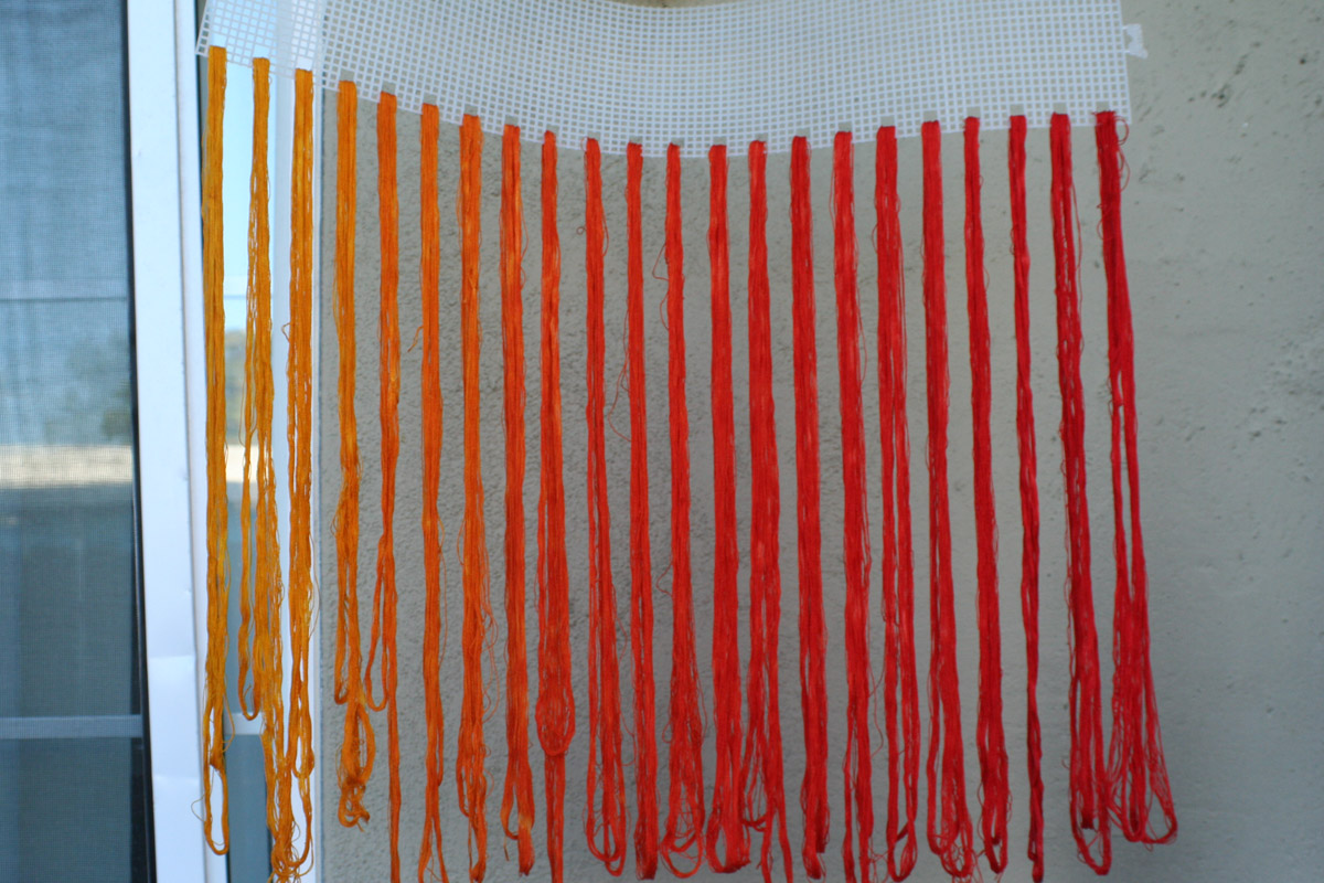
red to gold color gradient samples

These are a combination of Lanaset/Sabraset mustard yellow  and a stock solution of 80% Scarlet and 20% mustard yellow, which was the closest to cherry red in my dye sampling.

This is the first set of samples…there is a second set brewing, mostly progressing from orange to red, but with one additional sample from the gold range.  I thought I detected a slight jump from skein #4 to skein #5 (counting from the left), so I dyed one more in-between skein to see if that helped even things out a bit.

If the skeins look a little uneven, that’s my fault…I forgot to put in the Albegal SET, a leveling agent, and then didn’t stir the skeins enough, so got somewhat spotty results.  Lesson learned for the future!

And, finally, my plan for tonight: go out to celebrate my 40TH BIRTHDAY!!
Filed Under: All blog posts, dyeing, textiles, weaving Tagged With: doubleweave shawls, gradient colors

June 16, 2010 by Tien Chiu 1 Comment

Sometimes simpler is better

Yesterday we were both still pretty exhausted, so we mostly spent it on Granville Island, looking at the artisans and exploring the Granville Island Market, which I have to say is exceptional.  The Traveling Tigress, ever-inquisitive, poked her nose into shop after shop, discovering such delicacies as snake fruit, long kong fruit, sugar apples, kaffir limes, and birch syrup.  Mostly they weren’t terribly exciting (birch syrup tastes like watery molasses, sugar apples like a somewhat drier and more sugar-cane-y cherimoya), but the kaffir lime has real possibilities for chocolate.  I’m glad I now have a kaffir lime tree (thanks Blossom!) as that will give me a chance to try candied kaffir lime peel with chocolate this year.

There is also a decent chocolate shop in the market!  “Decent” as in “comparable to mine”, which is rare.  I’m suitably appreciative.

Anyway, I woke up this morning feeling far more refreshed, and as nothing was open and B. wasn’t going to be awake for another two hours, I started working on more variations of the double-gradient doubleweave.  It’s fidgety work – first I have to separate the liftplan into layers, then I have to apply pattern presets to those layers to “fill in” the liftplan with actual weave structures.  After that, I save the liftplan as a .bmp file, open Fiberworks PCW, cut and paste the liftplan into the threading file, and save the resulting file.  Then I take screenshots of both front and back of the cloth using SnagIt, take them into Photoshop, separate the warps and wefts into 4 different layers, and then apply a gradient to the weft layers.

All of which is basically explaining why it took me two hours to do three or four variants on the liftplan I was using.

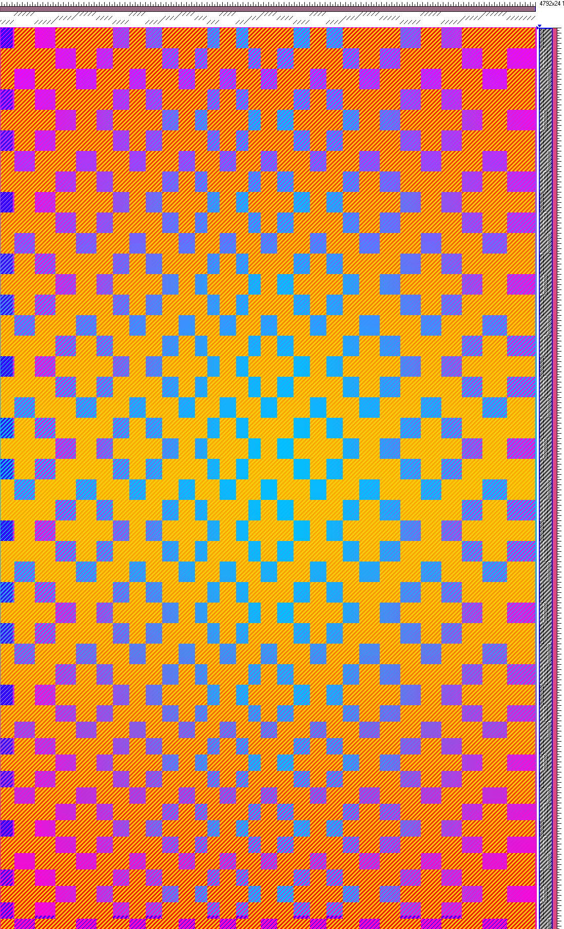
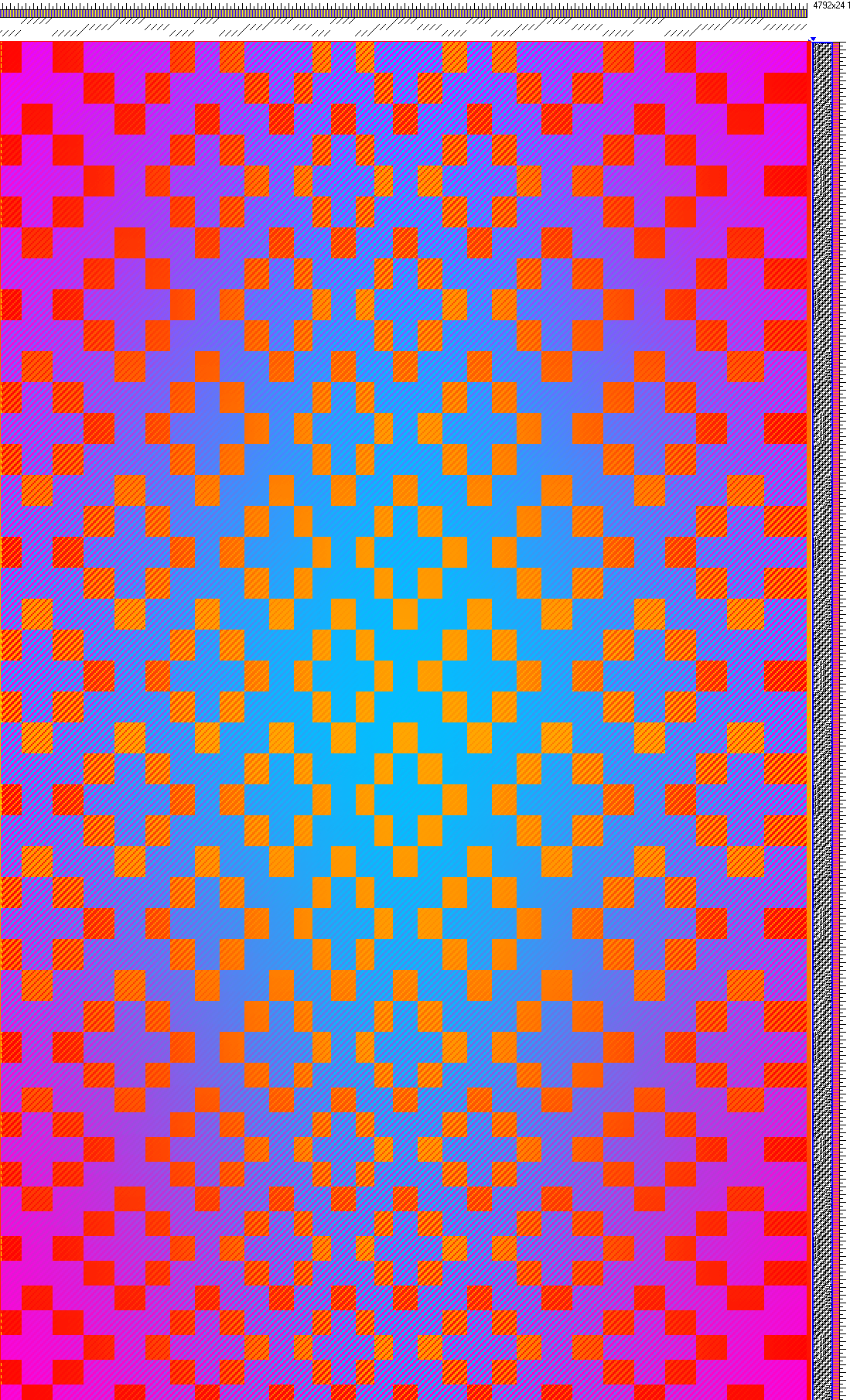
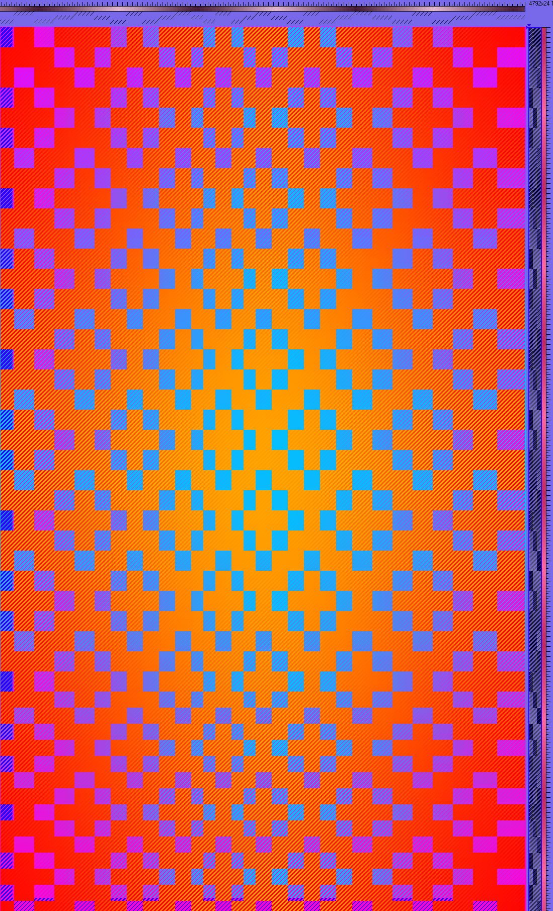
Here are the variants I tried.  They all look quite similar, but they’re not.  In the first one, the pattern squares (the diamonds) vary from 1/3 to 3/1 twill.  In the second, they vary from 1/3 to 2/2 twill.  In the last one, the pattern squares are all 1/3 twill.  The difference is in the slight vertical banding you can see if you look closely at the larger pix:

pattern blocks (diamonds) go from 1/3 to 2/2 to 3/1 twills
pattern blocks (diamonds) in 1/3 and 2/2 twill, predominantly 2/2 twill
pattern blocks entirely in 1/3 twill

Of the three, I like the last one (“pure” 1/3 twill) the best, suggesting that sometimes, simpler really *is* better.  (Something I have a hard time remembering!)

Off to breakfast!

Filed Under: All blog posts, textiles, weaving Tagged With: doubleweave, doubleweave shawls, gradient colors

June 8, 2010 by Tien Chiu 5 Comments

Another color mix

I “mixed” this up this morning:

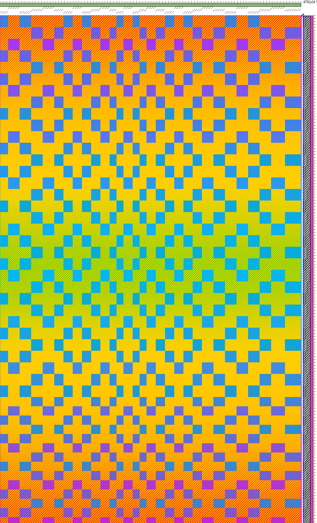
Red to green color gradient (going through orange) in one weft, purple to fuchsia in another; solid blue and gold warps, front view
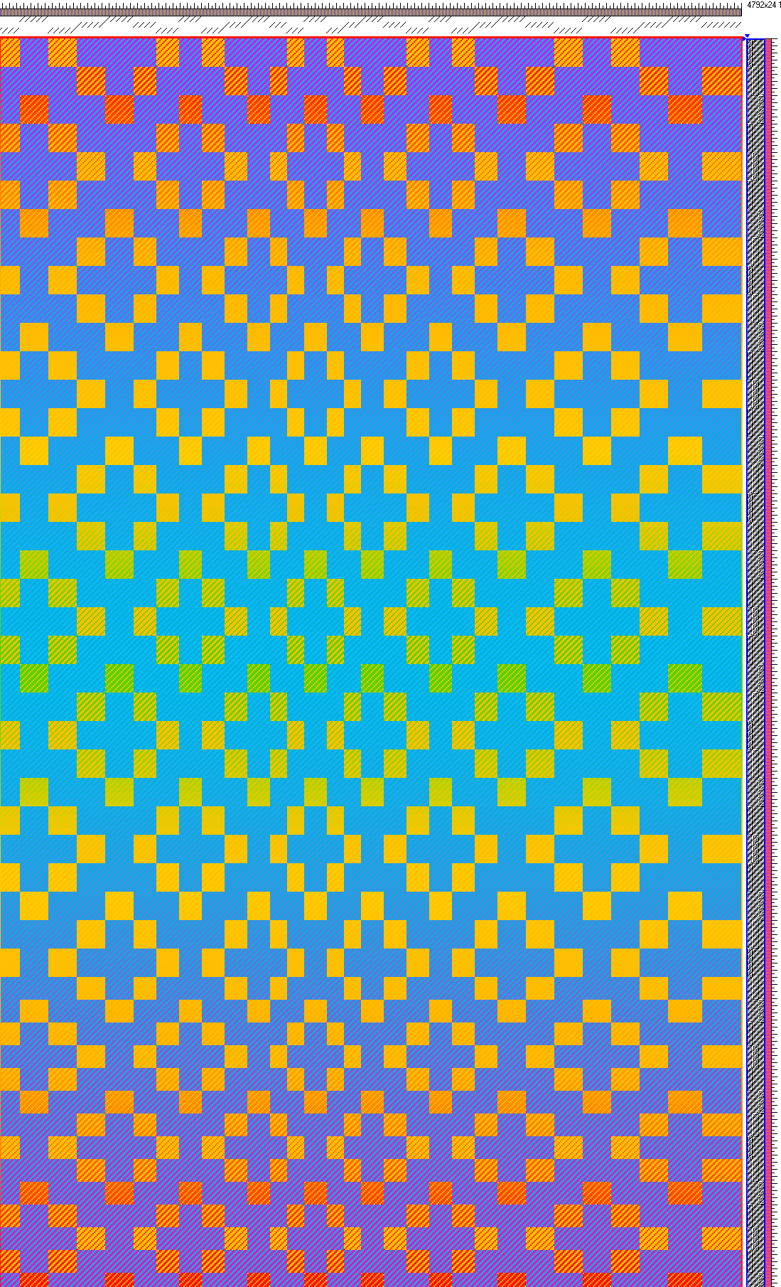
Red to green color gradient (going through orange) in one weft, purple to fuchsia in another; solid blue and gold warps, back view

I’m not sure I like the addition of the green; the value difference between the green and yellow makes a pretty visible value difference in the center of the “shawl”.  But if I “time” the green so it coincides with the lightest part of the turquoise,  perhaps that will help.

Regardless, I’ve learned a few things:

  • Strong color contrasts (opposite ends of the color wheel) will add a lot of “vibration”.  This looks ok to good if used as pattern, but is very distracting when used as background.  An interesting “solution” to this problem might be to make the background on the reverse side dominant in one of the two colors, e.g. a 3/1 twill rather than a 2/2 twill (which is how it is currently set up).  I’ll have to try that with a different draft.
  • Because of this, the overall appearance looks best if the weft gradient colors are (on the color wheel) located to either side of the warp that it weaves with.  In this case fuchsia/blue is weaving with turquoise, green/orange/yellow/red is weaving with yellow.  These are analogous colors, so look pleasing without too much “vibration” or dulling-out of colors.
  • Differences in value are also very visible and will produce a “stripe” effect even if the gradients are smooth.  The results that are most pleasing to my eye (at least in Photoshop) are those where there is only one gradient across the length of the entire shawl.  It might be possible to get a pretty result with lots of gradients across the entire shawl, but I think you’d have to make the pattern extremely simple, otherwise it would simply be too “busy”.

I’ve also decided that learning is easier if you’re only turning one set of knobs at a time.  If I were trying to understand the color interactions while simultaneously messing around with structure, it would be much harder to reach conclusions.  I’d never know for sure whether the color interactions were different because of the weave structure or because of the colors themselves.  As it stands, I’ve learned a lot from studying color in just one weave structure, and moreover a weave structure that weaves identically (only with reverse colors) front and back.

Now that I’ve a better idea of what happens with colors, I think I may move on to considering what can be done structurally to differentiate front and back – using the same profile draft, but “filling in” the draft with different  structures on front and back.

After that, if I still have time, I’ll play around with different profile drafts, to give wholly new patterns, though I don’t think that is strictly necessary.  I think I can get enough interesting variations with a single profile draft to occupy me for three shawls, and I don’t think that doing more profile drafts will teach me much more than fiddling with a single draft.  I already understand the process for layering structures using Photoshop, so that would just be a repeat of what I already know.

I’ve begun to calculate what I’ll need for this project, in preparation for dyeing yarn.  Because I need such small amounts of any given color, a small skein goes a loooong way.  (For weft yarn, I think I only need 3 grams of each color per weft, if there are 30 colors!)  So I am thinking I will either dye 30 gram skeins in a quart jar, or 50 gram skeins in a half-gallon jar.

The trade-off here is time: I can fit four half-gallons or 7-8 quart jars into my big dyepot.  This means that, to get 60 colors for a two-gradient shawl, I’d have to do fifteen batches of 50 grams, vs. only 8-9 batches if I use smaller skeins.  That’s 3 weeks’ worth of dyeing vs. about a week and a half, assuming I can get  one dyebath per day on most days.

The advantage of dyeing bigger skeins is that, as it is nearly impossible to match colors perfectly, it results in less waste – I can use a single batch of colors for a long time rather than having dye another batch and throw the leftover colors away.  (Or, rather, reserve them for undetermined “other uses”.)  The downside is that it takes a lot more time, and requires bigger upfront investment.  (90 colors, which is what it would take to do three color gradients, times 50 grams apiece = 4500 g or about 10 lbs of silk yarn!  Even purchasing cheaply from India, that’s $300-350 worth of yarn.)

So I’m still mulling that over.

All is (relatively) quiet on the wedding front.  Pretty much everything is settled at this point, so it’s just a matter of greeting the out-of-town guests as they arrive.

Filed Under: All blog posts, dyeing, textiles, weaving Tagged With: doubleweave, doubleweave shawls, gradient colors

June 6, 2010 by Tien Chiu 5 Comments

More gradients

My fingers are twitching to get into the dyepots.  Here’s what today’s Photoshop simulations turned up:

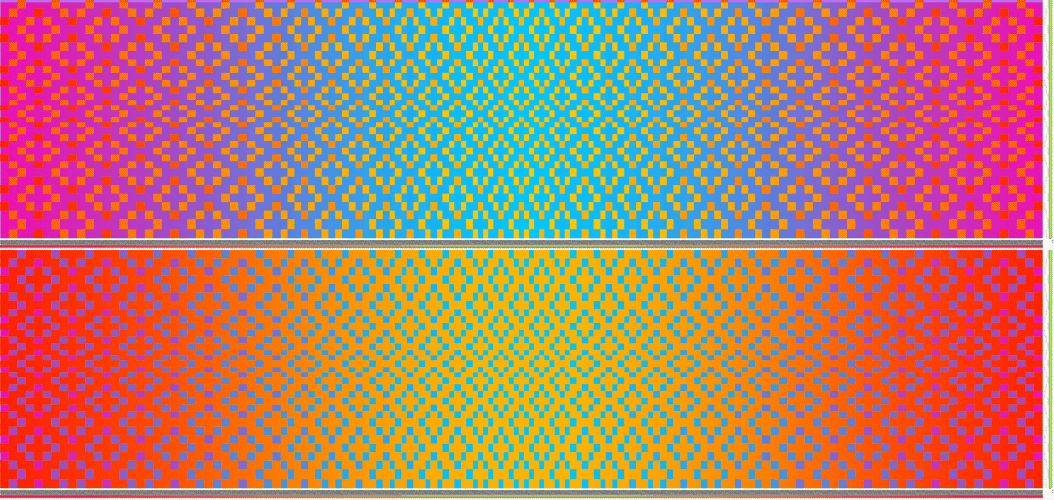
Block doubleweave with three gradients in warp and weft, back view

Here the blue/purple background is transitioning gradually from fuchsia at the edges to turquoise in the center, both along the warp and weft.  The other layer (orange/yellows) has a solid yellow warp, and a weft that changes colors gradually from red to orange and back again.

Here’s the back view (please click for the larger version, the resizing function blends out the colors unattractively in the smaller view):

Block doubleweave with three gradients in warp and weft, front view

I like this pair quite a bit.

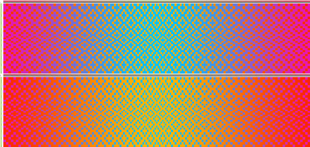
Then I said to myself, “Too much is not enough – what if I did FOUR gradients?”

And of course I had to answer my question:

Block doubleweave with four gradients in warp and weft, back view
Block doubleweave with four gradients in warp and weft, front view

Ooh, pwetty!  I MUST try it!

Of course, first I need to dye another 60-odd colors, so I can get those smooth color transitions in fuchsia/blue and red/orange…and finish weaving this warp so I can start up a double color gradient warp…

…and I can’t do any dyeing until AFTER the wedding (T minus 6 days!)…

…so instead, I’m sitting on my hands and saying “MUST….NOT…DYE…YARN!!  MUST…NOT…DYE…YARN!!”

I’m sure it would be amusing, if I weren’t so eager to get into the pots.

Meanwhile, the ceremony is finalized, the music selected, vows written, my little speech to the groom sent off to the officiant…pretty much everything is ready.  So I’ve been burning off my nervous energy by cleaning up the house.  It’s not neat by any means, but it has less stuff cluttering every surface than it usually does.

Filed Under: All blog posts, dyeing, textiles, weaving Tagged With: doubleweave, doubleweave shawls, gradient colors

May 29, 2010 by Tien Chiu 1 Comment

Oh my.

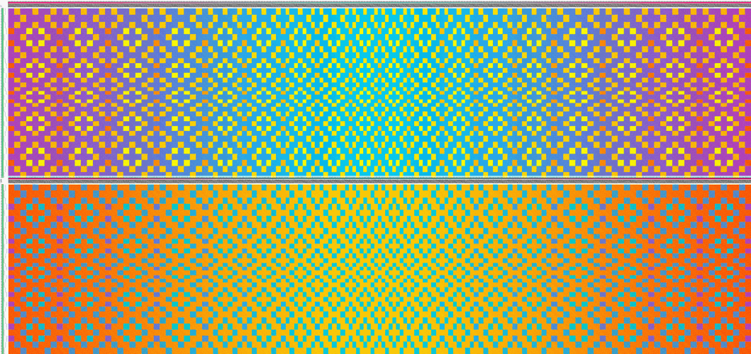
Yesterday I started playing (via Photoshop) with graduated colors in the weft.  And look what I came up with!

simulation of graduated color weft

Here there are still two wefts, both changing colors, but on different cycles.  Weft A (weaving with the blue warp) goes from fuchsia to turquoise and back again.  Weft B (weaving with the yellow warp) does the same, but with two complete cycles from  fuchsia to turquoise.

Isn’t that GORGEOUS???

After I had done it, it occurred to me that I actually had a dark turquoise warp, so I did another simulation, only with turquoise:

simulation 2 - turquoise warp

Not quite as nice in my opinion, but pleasing nonetheless.  So I will definitely be trying this (possibly first!).

I also figured out what I was doing wrong with the networked doubleweave, thanks to Pat Stewart.  I like the look of the blocks better, as the threading forces the networked liftplan into blocky curves, but will probably do some network drafted work out of curiosity if nothing else.

And now, off to do some tapestry work!  I’m woefully behind on my tapestry “homework” and need to put in some solid hours of work to catch up.  Later today I’ll start threading up the floor loom so I can weave some of these luscious doubleweave patterns!

Filed Under: All blog posts, textiles, weaving Tagged With: doubleweave, doubleweave shawls, gradient colors

  • « Previous Page
  • 1
  • 2
  • 3
  • 4
  • 5
  • …
  • 13
  • Next Page »

Archives

Tags

aids lifecycle outfits autumn splendor book cashmere coat cats celtic braid coat color study cross dyeing design design class devore doubleweave doubleweave shawls drawing dye samples dye study group gradient colors house infinite warp jacquard loom katazome knitted blanks kodachrome jacket ma's memorial mohair coat network drafted jacket/shawl project network drafting painted warp phoenix rising phoenix rising dress phoenix rising kimono phoenix rising reloaded pre-weavolution project sea turtles taquete tie-dye tied weaves tomatoes velvet weaving drafts web design website redesign wedding wedding dress woven shibori

Categories

  • Africa
  • aids lifecycle
  • All blog posts
  • All travel posts
  • Asia
  • Bangkok
  • Belize
  • Cambodia
  • Central America
  • Chai Ya (Wat Suon Mok)
  • Chiang Mai
  • Chiang Rai (Akha)
  • China
  • chocolate
  • computer stuff
  • creating craft
  • Creative works
  • cycling
  • Delhi
  • Dharamsala
  • drawing
  • dyeing
  • Fiber Arts
  • finished
  • food
  • garden
  • Ghana
  • Guatemala
  • Hanoi
  • Ho Chi Minh City
  • Hoi An
  • India
  • Khao Lak
  • knitting
  • Knitting
  • Ko Chang
  • Laos
  • Luang Namtha
  • Luang Prabang
  • markleeville death ride
  • meditations on craft
  • mental illness
  • musings
  • Phnom Penh
  • powerlifting
  • Rewalsar (Tso Pema)
  • sewing
  • Siem Reap (Angkor Wat)
  • Southeast Asia
  • surface design
  • textiles
  • Thailand
  • travel
  • Vangvieng
  • Vientiane
  • Vietnam
  • Warp & Weave
  • weaving
  • Weaving
  • weavolution
  • writing

© Copyright 2025 Tien Chiu · All Rights Reserved ·

Loading Comments...