Tien Chiu

  • Home
  • About Tien
  • C.V.
  • Online Teaching
  • Works
  • Essays
  • Travels
  • Book
  • Blog
  • Dye samples
You are here: Home / Archives for knitted blanks

September 24, 2011 by Tien Chiu 1 Comment

New design

I went up to see Sharon today, samples and coat muslin in tow.  I brought along the coat muslin because, even though the pattern pieces were too wide for my fabric, I loved that doggone collar and wasn’t quite ready to let it go.

And I didn’t have to!

Here is a sketch of our planned design:

Autumn Splendor, design sketch - asymmetric front and back

The right side will have a mix of bright autumn colors – gold, orange, red, burgundy, purple.  The left side will be a mix of darker colors – burgundy, purple, and brown mostly.

The collar, which I had originally intended to be a deep green (silk or velvet), came out looking garish in the sketches, probably because the green doesn’t relate to any of the other colors – oranges, reds, and warm purples/browns.  It would work better if there were more blues or blue-purples.  So instead, we substituted a purple collar, which provides both color and value contrast with the top of the front – adding considerable interest and drawing the eye upwards, towards the wearer’s face.  (In the sketch it looks rather garish, but see the photo below.)

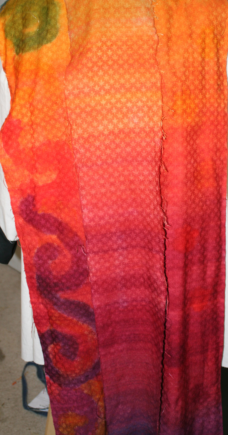
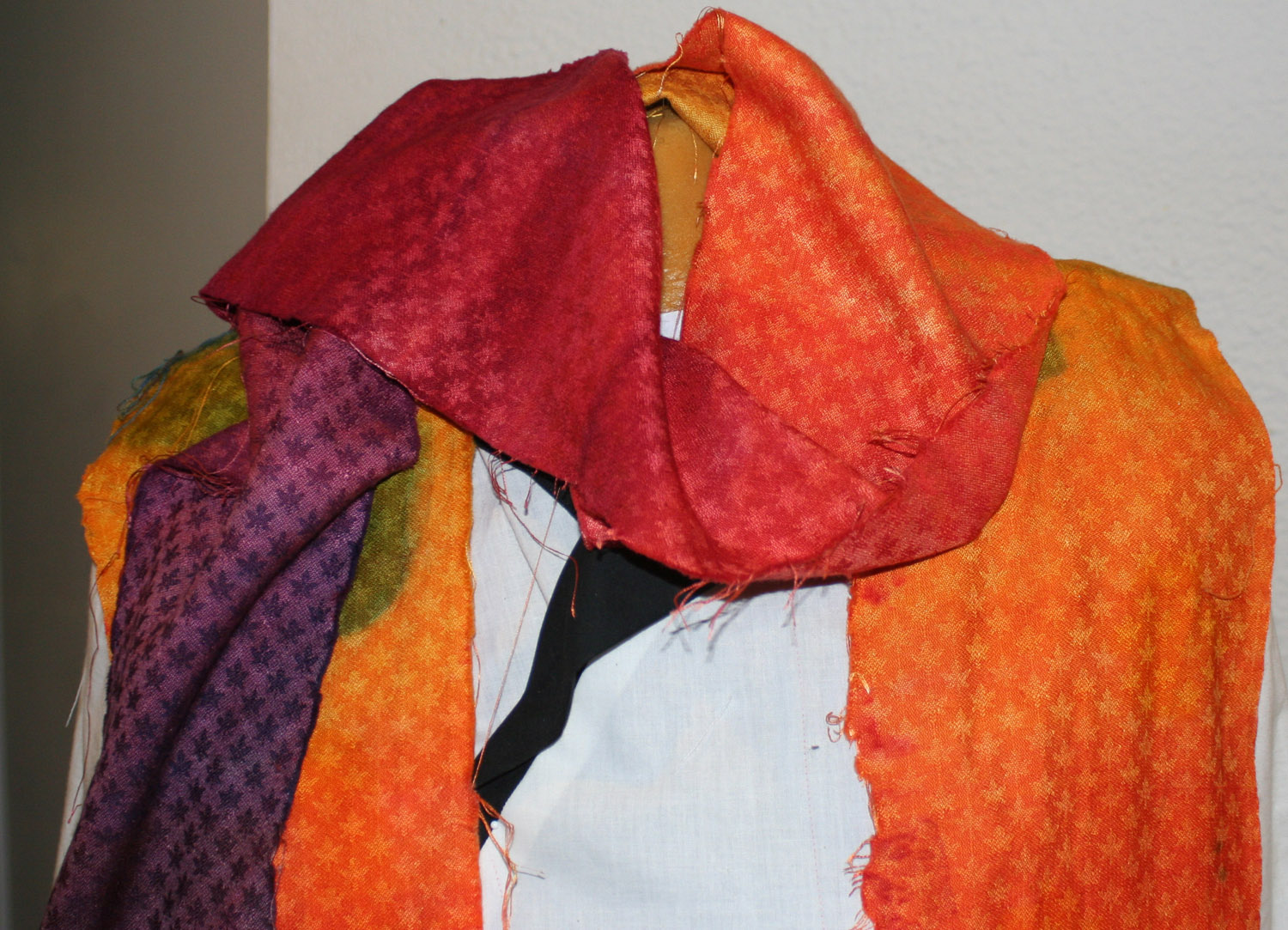
Here is a drape of the sample over the coat, showing the color sequence and the contrast collar:
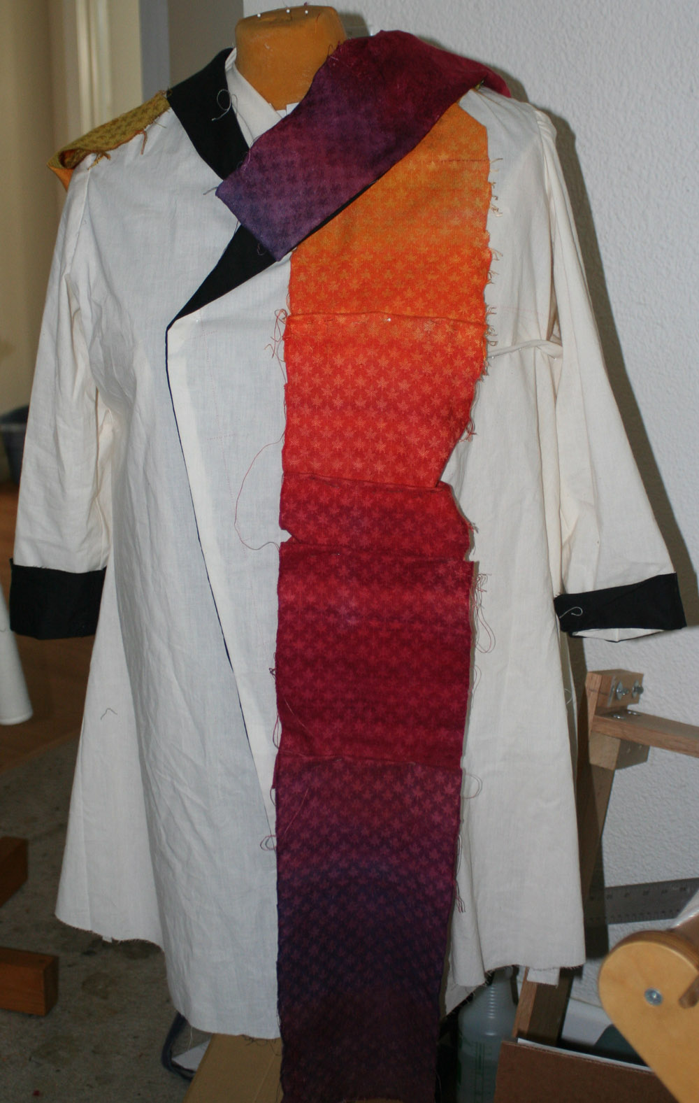
autumn splendor, rough mockup

Both the purple and the yellow lean towards red, making the contrast much less garish than, say, acid yellow against violet – enough to be interesting, but not overpowering.  The purple collar fabric is actually the reverse of the sample fabric, with dark wool leaves and lighter silk background.  I like this effect and may use it, but I’ll have to monkey with the design first, as there are unsightly floats on the reverse face.

Here are two of the designs we tossed around en route to the one we liked:
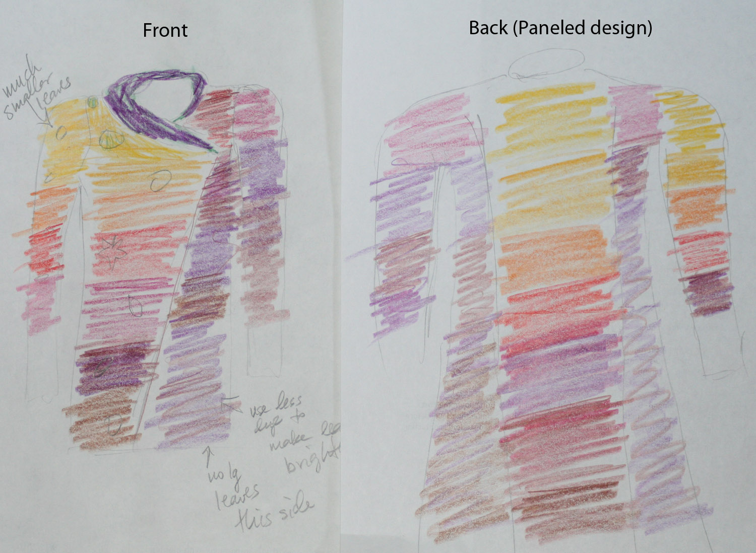
unused design - center back panel

We tried this design in hopes of avoiding an unsightly center-back seam.  Because the panels are individually hand dyed before weaving, there’s no hope of getting the color changes to match perfectly.  A center back seam would make  this super obvious, and of course there’s no way to cut the entire back out of a single piece if you can only weave 22″ wide fabric!  The idea was to contrast the bright panel against the darker colors, so the non-matching colors would be clearly intentional.

The reason we rejected this design is because the color imbalance is distracting.  The sleeve matches the adjacent panel on the left side, but not on the right side, and I didn’t like the alternation between light  to dark to light.  And, the colors at the shoulder seams would not match.

And here is another one with slightly different construction:
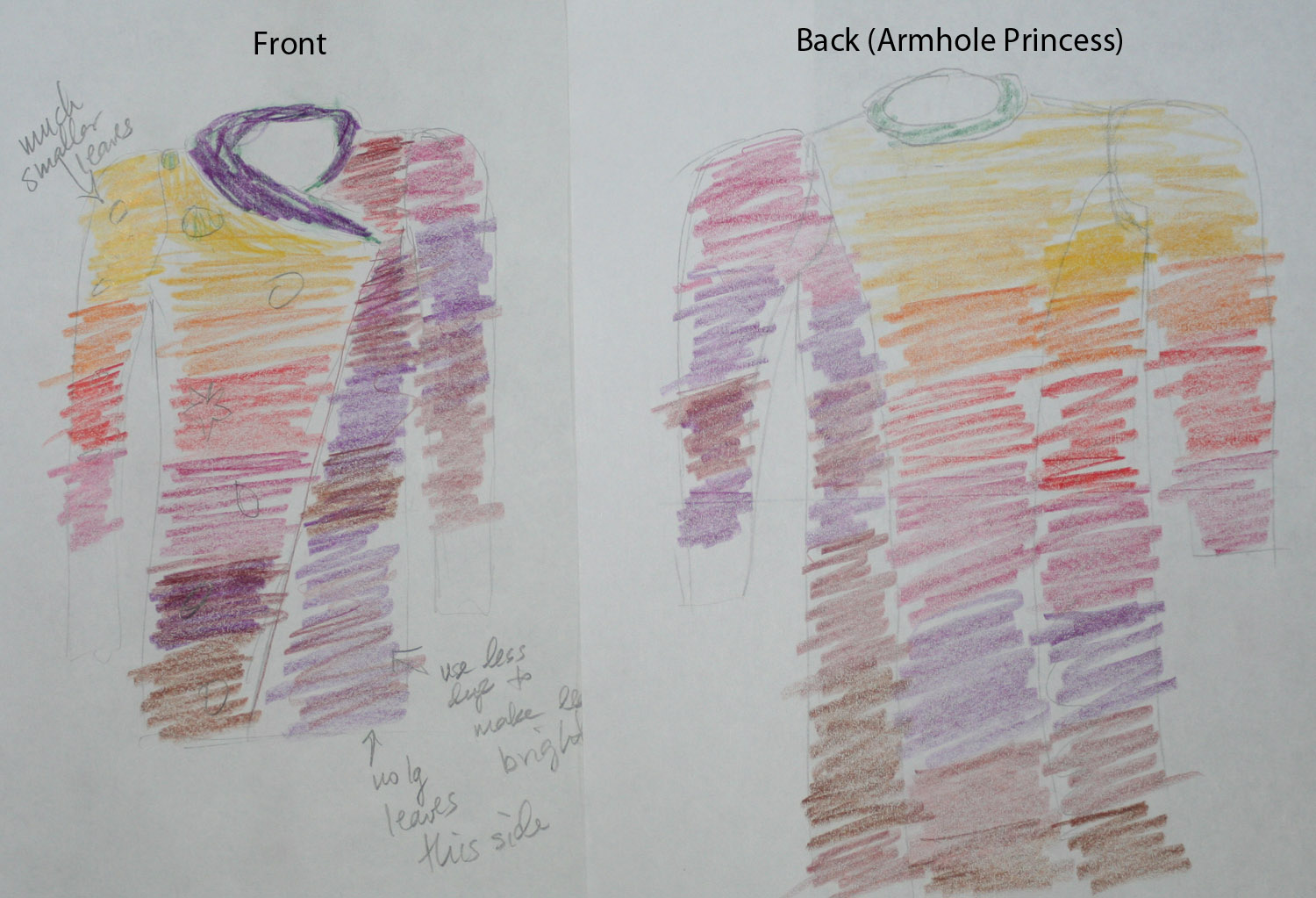
unused design - armhole princess in back

This one wasn’t quite as distracting as the paneled design, but I felt it was badly unbalanced – light colors and warm colors tend to dominate, so the large amounts of gold, orange, and red in the top right section unbalance the design.  I wanted something with more of the darker colors, that wouldn’t look quite so garish.  (Also, the shoulder seams would still clash, with gold meeting purple on the left shoulder.)

And here, just as a reminder, is the one that was Just Right:

Autumn Splendor, design sketch - asymmetric front and back

This is much better, for many reasons:

  • the asymmetrical theme/energy of the front is echoed in the back
  • the greater “strength” of the bright colors is balanced against a larger quantity of dark color
  • adjacent panels in the body are different colors, so seams don’t need to match
  • shoulder seams are compatible colors
  • diagonal line in back adds movement and interest, important since this piece is about autumn, the season of change, leaves drifting down on the air currents.

The little circles on the sketches represent falling leaves.  I was planning to silkscreen leaves directly onto the fabric using my new-to-me thermal screen printer, but am now thinking that I will silkscreen patterns onto a different fabric and applique the leaves to the main body of the coat.  This has the dual benefit of allowing me to see/arrange the materials on the finished coat, and reducing the chance of costly screwups. I’m not an experienced screen printer and have zero experience with thermal screens, so am terrified of screwing up while printing onto my laboriously prepared blank.

One final (and encouraging!) note: this may take far less time than anticipated to weave up.  I had been expecting to weave twelve 54″ panels for a princess line design, but with only six panels in the design, and a shortened length of about 48″ (40″ plus extra for hems, etc.), it should go much quicker.

Off to knit the first blank!
Filed Under: All blog posts, dyeing, sewing, textiles, weaving Tagged With: autumn splendor, design, knitted blanks

September 23, 2011 by Tien Chiu Leave a Comment

No shortcuts

I finished weaving and dyeing the white-on-white sample today.  I realized that overdyeing with fiber-reactive dyes was mostly going to be a lost cause, as the darker colors wouldn’t shift much.  So I only did an acid dye dyebath.

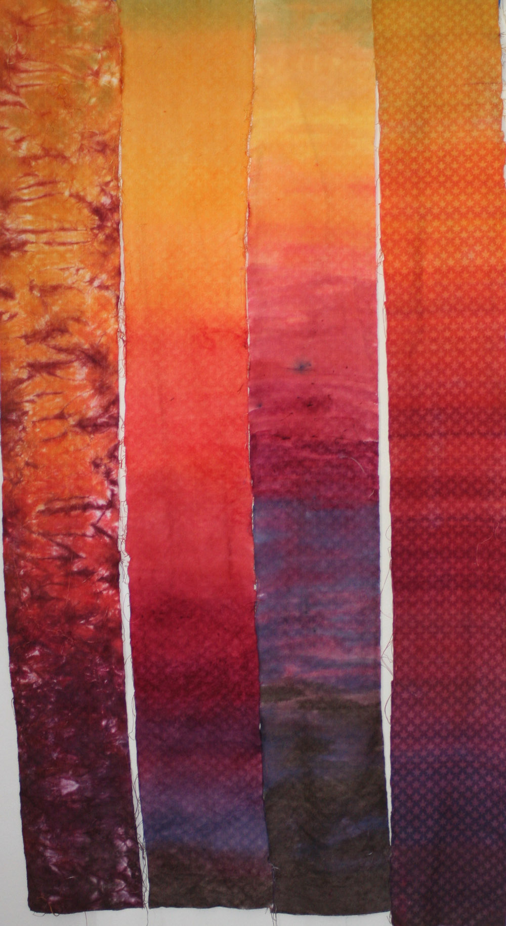
Here, left to right, are the three samples plus the “winning” sample from the last round:

four samples for Autumn Splendor

The left-hand piece was made by using low-water immersion type techniques (they called it “scrunch-dyeing” when I learned it in college).  I had intended to make it shade more gradually from one color to another, but the purples “bled” across the bottom of the container and popped up in the yellow and orange sections.  It does add considerable visual interest to the piece, and as a piece of dyed fabric I like it – but it doesn’t reflect my vision for autumn colors, and the woven maple leaves are almost invisible.  I could have started with a commercial fabric and gotten very similar results.

The second-from-left piece is painted-on acid dyes, shading evenly in hue.  To me it lacks character, and the maple leaves aren’t especially visible.

The second-from-right piece is painted-on acid dyes, with horizontal brush strokes and less color blending.  This is more interesting than the leftmost piece, but still doesn’t do much for me, and the maple leaves are not really visible.

The rightmost piece, of course, is my favorite sample from the knitted-blank batch of samples, and it is still my favorite.  The color gradation looks right, the irregular stripes add interest, the maple leaves are visible, and it just “feels” more like a handwoven piece to me.

So no shortcuts: I’ll do this the slow-but-best way, which will take about ten hours per panel – two hours to knit, 1-2 hours to dye, two hours to unravel, five hours to weave and wet-finish.  So it will most likely take me 8-12 weeks to weave twelve panels – possibly longer, since November is Chocolate Month.

What next?  I’m debating between updating the jacket muslin and playing some more with surface design.  I’m envisioning smallish falling leaves on the panels, screen printed or embroidered (or both!), in shades of green, yellow, and bright red, with metallic gold veining.  I also want to try out my new thermofax machine!  I lucked into a thermofax (a thermal screen printer) about two weeks ago – a tattoo parlor was moving and had posted it on Craigslist at half the “going rate”.  I spotted the ad fifteen minutes after it was posted, and immediately hopped in the car.  Miraculously, no one else got there before I did, so I paid for it and carted my booty home.

(Thermofaxes were popular about 30-40 years ago as a way of making transparencies.  Since then they have basically fallen into disuse – most were thrown away when they became obsolete – but the prices for a working thermofax are astronomical because tattoo shops have found they’re a great way to print out masters for their designs!  A few new ones are being made but they are about $1500 – prohibitively expensive!)

Anyway, the advantage of thermofaxes is that you can make and use a screen immediately, instead of the lengthy process required for silk screening.  Also, the thermal screen can be placed into a small, thin frame instead of the fairly bulky frame needed for screen printing, which enables you to (a) print both sides of the screen, and (b) print motifs closer together without waiting for the previous motif to dry.

The final advantage of a thermofax is that the screen is more transparent than a silk screen, making it easier to see what you’re doing.

Enough typing!  On to the next thing!

Filed Under: All blog posts, dyeing, textiles, weaving Tagged With: autumn splendor, knitted blanks

September 19, 2011 by Tien Chiu 2 Comments

…and one was just right.

I rinsed out the samples today at lunchtime, and ironed them dry:

three finished samples

The one on  the left is far too high-contrast to use in the garment I have in mind, and I think the same could be said of bold patterns generally.  Also, the pattern clashes with the leaf pattern woven into the fabric.

The one on the right was an attempt at a subtle leaf pattern.  Too subtle, and the stenciling came out too blobby, not leaf-like enough.

But the one in the center is Just Right.  It was made by mixing colors close to, but not quite the same as, the colors in the wool, to give a subtle contrast between silk and wool.  The result is a color gradation that smooths out some of the striations in the wool without covering them up, and a subtle leaf pattern that comes and goes as the fabric moves.

Here is a photo of the middle sample scrunched up, so you can see what I mean:

middle sample, rumpled

The leaves appear and disappear depending on how the fabric catches the light.  Perfect for autumn!

One interesting question is whether I need to knit up the blanks at all.  How important to me are the horizontal ridges of color?  If I’m willing to do a more “organic” pattern, I can weave the fabric in white on white (saving myself from an awful lot of blank-knitting!) and then dye the wool and silk at once, using acid dyes, relying on the differential take-up of silk vs. wool in acid dyes to give subtle contrasts.  If that doesn’t please, I can then overdye the silk in a slightly different color, using fiber-reactive dyes, to give a second pattern.

The one problem with the weave-it-in-white theory is that I am having equipment problems at the moment: some of the shafts are not lifting when they should.  With a strong contrast between warp and weft, I can see when this is happening (well, some of the time anyway); with white on white, it would be impossible.  I think I need to troubleshoot the loom before weaving another sample.

But I like this idea a lot, and will test it out as soon as I have the time.  Which may be next week – this week I need to work on muslins, as I’m going up to see Sharon on Saturday.

Filed Under: All blog posts, dyeing, textiles, weaving Tagged With: autumn splendor, knitted blanks

September 17, 2011 by Tien Chiu Leave a Comment

Finished weaving sample #6!

And here it is:

fully woven sample - white silk warp, dyed wool weft

Here are some closer views of the sections:

sample #6 - golds and oranges
sample #6 - reds and purples
sample #6 - dark purple and brown

Thoughts:

  • I need either more striation or less.  Currently there’s striation in some places but not in others, which makes it look like a mistake or an uneven dye job.  I haven’t decided which I prefer; it will depend in part on what happens with my dye experiments.
  • I need to add more gold and yellow-orange.  I thought I had lots, but it pollutes very easily with other colors.
  • I should probably ditch the dark purple (just before brown) and replace it with a warm rust brown.  Will meditate on that tonight.
  • It looks a little washed out, but that’s because of the effect of the white silk.  Once dyed, it should look far more intense.

Tomorrow morning I will cross-dye the sample, painting it with various color schemes, and see what happens.

Ann asked how I could cross-dye the fabric when silk and wool are both protein fibers.  The answer is that silk is the only natural fibers that “goes both ways”: you can dye it with fiber-reactive dyes and soda ash (a la cellulose fibers) AND you can dye it using acid dyes, in the normal protein-fiber manner.  So I am taking advantage of this to dye the silk using the cellulose method, which won’t dye the wool.

Off to dinner!  Tomorrow morning I will wet-finish the sample and begin playing with dyes.  I never did get a chance to do a small sample with fiber-reactive dyes, so I’m just going to gamble that the method I used earlier, with tencel/alpaca, will work with without harming the wool.

Filed Under: All blog posts, dyeing, textiles, weaving Tagged With: autumn splendor, knitted blanks

September 17, 2011 by Tien Chiu 3 Comments

Halfway through

I wove fairly obsessively yesterday, and got through three of four-and-a-half pirns.  I’m at the three-foot mark, so I’m actually a bit over half done.

Here is a pic of the woven sample:

sample, photographed from below (which is why you can see the cloth beam)

It’s looking good!  There is some subtle striation that adds “texture” to the colors – like the horizontal stripes in sandstone.  Not as much striation as I would like, though, so maybe I’ll try for blobbier blobs next time.

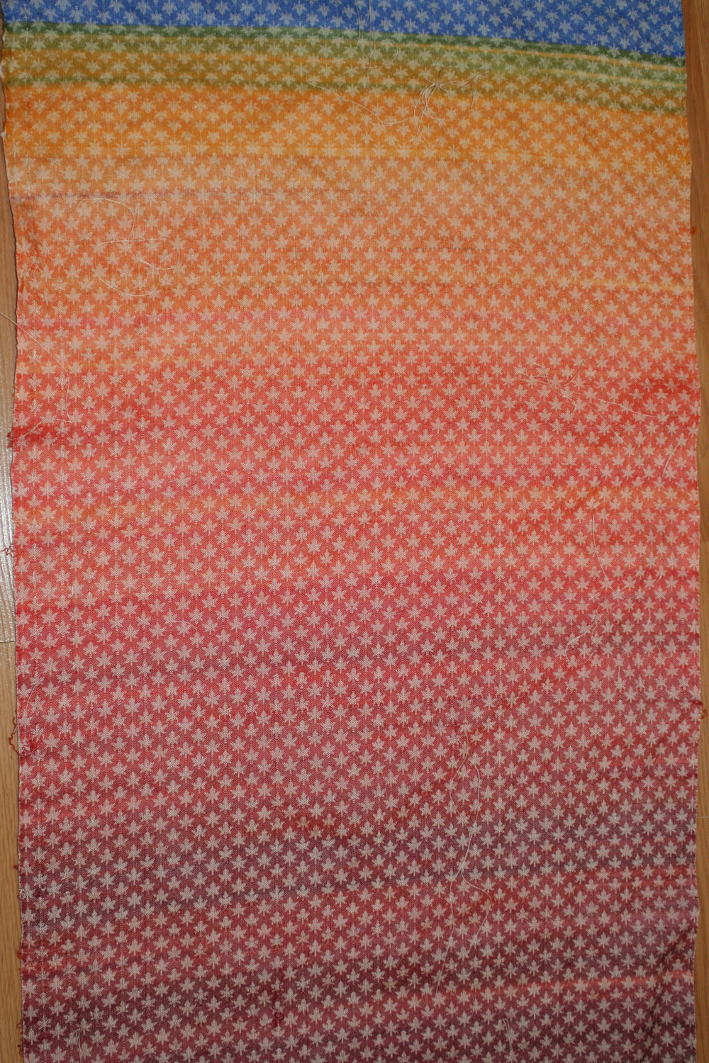
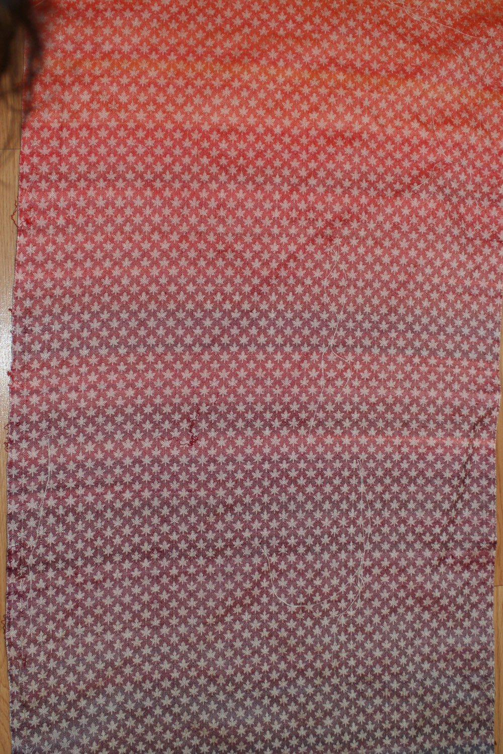
Here is a pic of one of the previous blanks that shows the effect I’m after:

previous sample (#5 in the series)

This is one of the reasons I’m using a knitted blank (to answer Ruth’s question).  If I were weaving with gradually changing stripes, I’d get something more like this:

smooth color gradations

Also pretty, but not the effect I’m after right now.

The other reason to use a knitted blank is that I do want a smooth progression of color, and my experience has been that stripes produce highly visible horizontal lines unless the colors are VERY close to each other.  To get the smooth color gradations in Liquid Fire (the orange piece above), I had to dye twenty shades of red/orange/yellow.  With five colors in this piece (gold, orange, red, purple, brown), that would be 100 skeins, which would be more effort than a knitted blank.  Swapping out the weft yarns won’t work well because I’m already using a yarn at 15,000 yards per pound – the most I could do would be two strands of 120/2 silk, which would be a pain to wind into skeins, dye, and rewind onto cones.  It also wouldn’t let me do the cross-dyed effects I want to introduce later – for that I need wool or cotton, or any natural fiber that isn’t silk!

So I am pretty much stuck with knitted blanks.  Hopefully, doubling the length of the row should also halve the time to knit and unravel.

Plans for this weekend include:

  • Finish weaving the sample for my Handwoven article
  • Weave the knitted blank and test out various cross-dyed color patterns in fiber-reactive dyes
  • Go to a class on glasswork on Sunday (it sounded interesting, so what the heck)
  • Clean up the studio – major undertaking, probably also a purging of stuff, as I’m running out of “away” to put!
  • Start sewing up a new round of muslins, since I’m going to see Sharon next weekend!
If I can get four of the five done this weekend, I’ll be content.

Filed Under: All blog posts, dyeing, textiles, weaving Tagged With: autumn splendor, knitted blanks

  • « Previous Page
  • 1
  • 2
  • 3
  • 4
  • 5
  • 6
  • Next Page »

Archives

Tags

aids lifecycle outfits autumn splendor book cashmere coat cats celtic braid coat color study cross dyeing design design class devore doubleweave doubleweave shawls drawing dye samples dye study group gradient colors house infinite warp jacquard loom katazome knitted blanks kodachrome jacket ma's memorial mohair coat network drafted jacket/shawl project network drafting painted warp phoenix rising phoenix rising dress phoenix rising kimono phoenix rising reloaded pre-weavolution project sea turtles taquete tie-dye tied weaves tomatoes velvet weaving drafts web design website redesign wedding wedding dress woven shibori

Categories

  • Africa
  • aids lifecycle
  • All blog posts
  • All travel posts
  • Asia
  • Bangkok
  • Belize
  • Cambodia
  • Central America
  • Chai Ya (Wat Suon Mok)
  • Chiang Mai
  • Chiang Rai (Akha)
  • China
  • chocolate
  • computer stuff
  • creating craft
  • Creative works
  • cycling
  • Delhi
  • Dharamsala
  • drawing
  • dyeing
  • Fiber Arts
  • finished
  • food
  • garden
  • Ghana
  • Guatemala
  • Hanoi
  • Ho Chi Minh City
  • Hoi An
  • India
  • Khao Lak
  • knitting
  • Knitting
  • Ko Chang
  • Laos
  • Luang Namtha
  • Luang Prabang
  • markleeville death ride
  • meditations on craft
  • mental illness
  • musings
  • Phnom Penh
  • powerlifting
  • Rewalsar (Tso Pema)
  • sewing
  • Siem Reap (Angkor Wat)
  • Southeast Asia
  • surface design
  • textiles
  • Thailand
  • travel
  • Vangvieng
  • Vientiane
  • Vietnam
  • Warp & Weave
  • weaving
  • Weaving
  • weavolution
  • writing

© Copyright 2025 Tien Chiu · All Rights Reserved ·

Loading Comments...