Tien Chiu

  • Home
  • About Tien
  • C.V.
  • Online Teaching
  • Works
  • Essays
  • Travels
  • Book
  • Blog
  • Dye samples
You are here: Home / Archives for ma’s memorial

December 14, 2015 by Tien Chiu 4 Comments

The elusive circle

I spent all day yesterday questing for the elusive circle. A perfect circle is something of a Holy Grail when it comes to weaving – both because it is difficult to do within the limitations of most looms, and because it implies incredibly precise and consistent weaving. Weaving on a floor loom is rectilinear – threads crossing threads at right angles – so the only way to get a circle is to know exactly how many picks (weft threads) and ends (warp threads) per inch in your finished fabric, and stretch or squash your weaving draft to compensate for any differences.

But wait! That’s not all. Cloth under tension on the loom is not the same dimensions as cloth that has been removed from the loom. When you wash fabric, the threads relax, which shrinks the finished fabric. And not consistently, either: it generally shrinks more in one direction than the other. And in the warp, the edge threads get woven more densely than the center threads, so you cannot just measure your fabric crosswise, divide by the number of inches, and think you know the density of your warp. And so on.

Normally, accuracy isn’t critical. If your image gets stretched or squashed by 5-10%, it generally doesn’t matter too much. But if you are using circles in your design, accuracy becomes critical because people are very good at distinguishing circles from ovals – even more so than, say, distinguishing squares from rectangles. So to weave a perfect circle means you know precisely how the woven cloth will behave once it’s taken off the loom, can modify the design to compensate for the many things that shrink or weave to different dimensions, and can weave with enough precision that all the theoretical numbers work out.

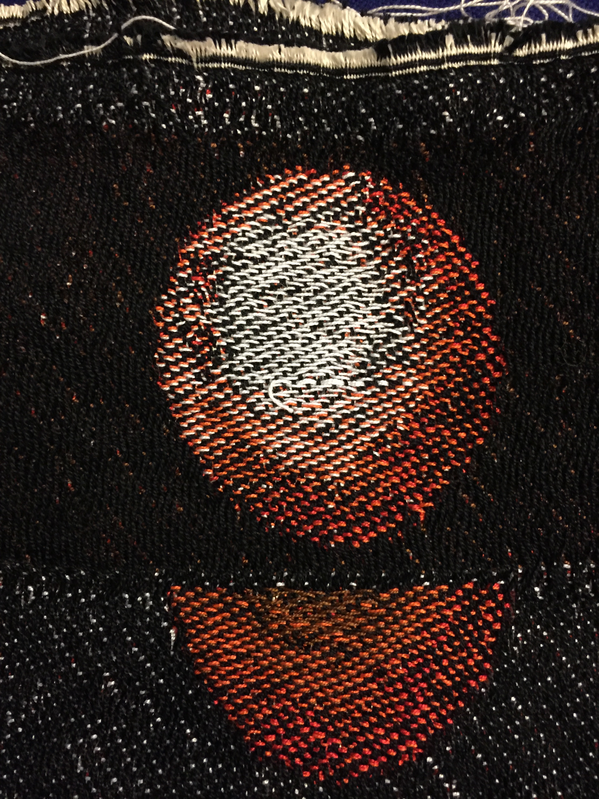
So, with all that as background, may I present a perfect circle?
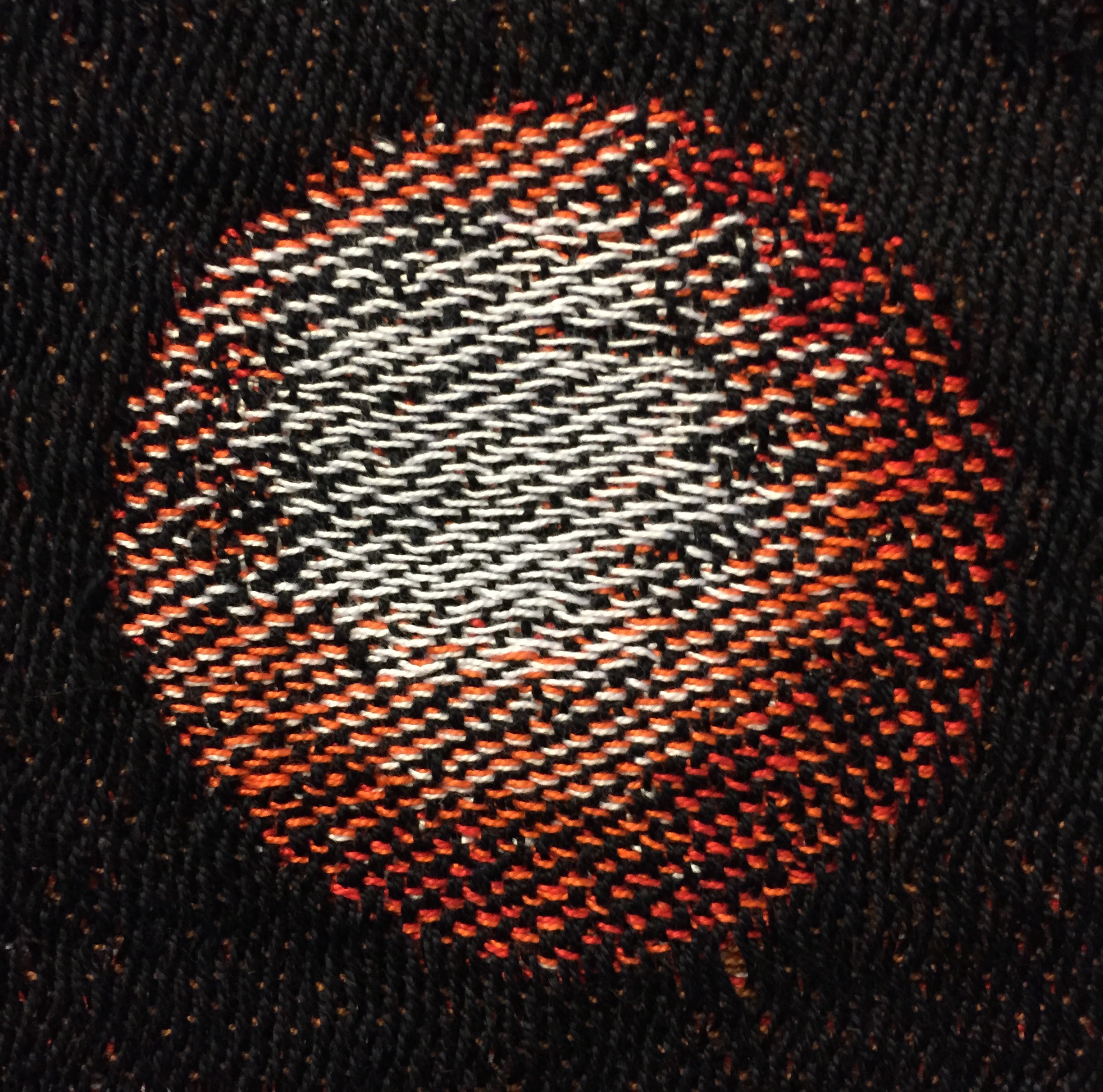
a perfect handwoven circle

Lest you be too impressed, here are attempts 1 and 2:
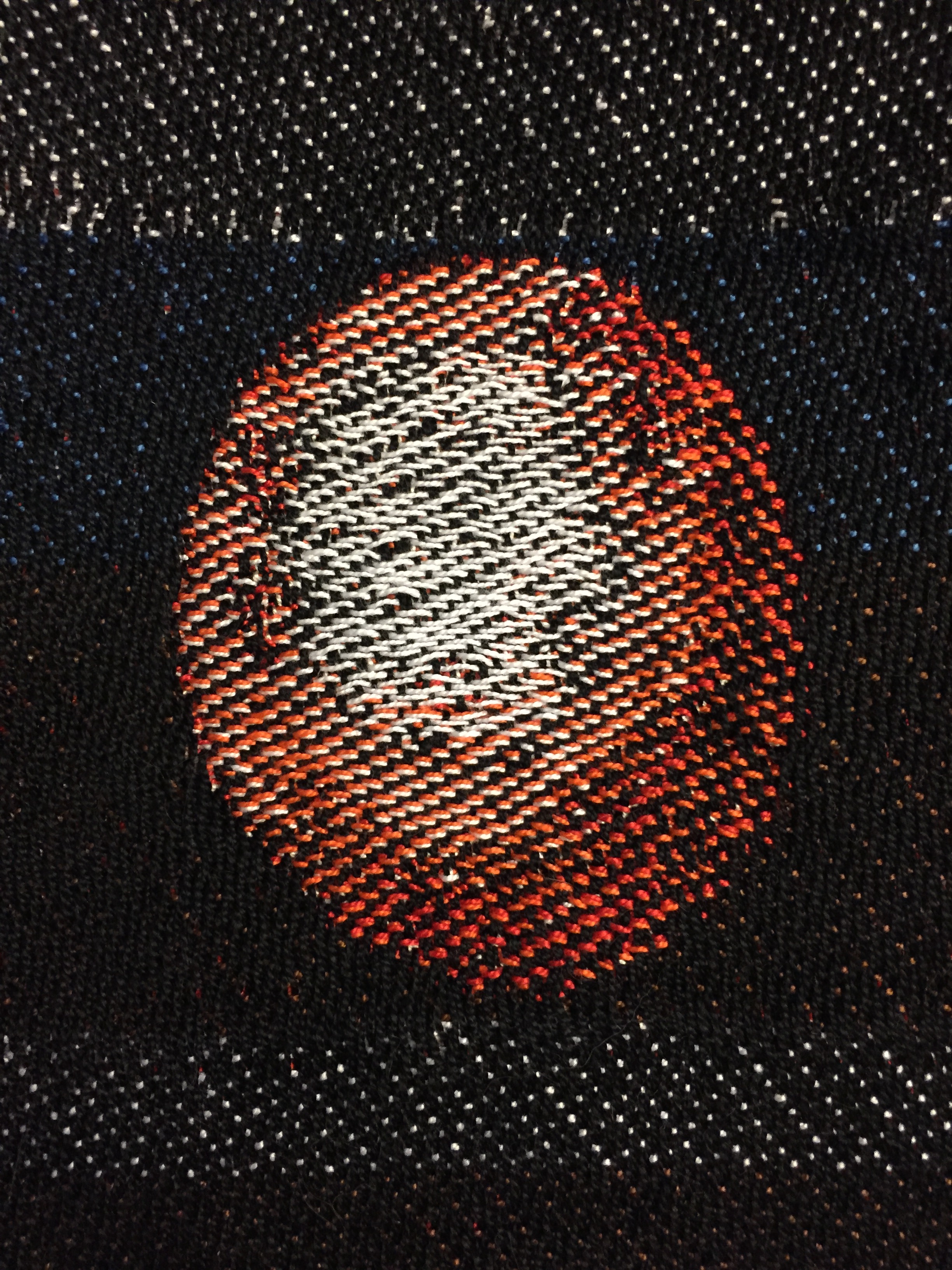
woven circle - first attempt
woven circle – first attempt
woven circle - second attempt
woven circle – second attempt

Attempt #1 was a wild shot in the dark, based on educated guesses about the number of threads per inch in warp and weft. (I used different colors since I didn’t want to waste my precious, limited supply of hand-dyed weft.) I didn’t expect this attempt to work, but after carefully measuring the dimensions of the finished piece and doing all the calculations, I did expect a circle from attempt #2. Alas, the problem with empirical measurement is that it doesn’t care about theory, and I wound up with another oval. So I decided that this time, rather than measure the dimensions of the finished piece, I was just going to measure the goddamn circle, goddammit, and adjust the aspect ratio so the circle would weave properly, even if nothing else did. And that finally worked!

(To understand my frustration, realize that each sample represents an investment of at least three to four hours. Each sample is about 600 picks long, and takes an hour or more to weave. Then you have to cut it off, retie the warp so you can weave the next sample, wash it, and wait for it to dry. Then you have to press it. Only then can you decide whether it’s a circle.)

So I spent all day yesterday chasing the Holy Grail. And all because I was unwise enough to include a full moon in my design!

But now that I’ve achieved a perfect circle, I’m happy I invested the time. An oval moon would have been totally unacceptable in the finished piece! and this way I know that my image will weave up exactly as expected.

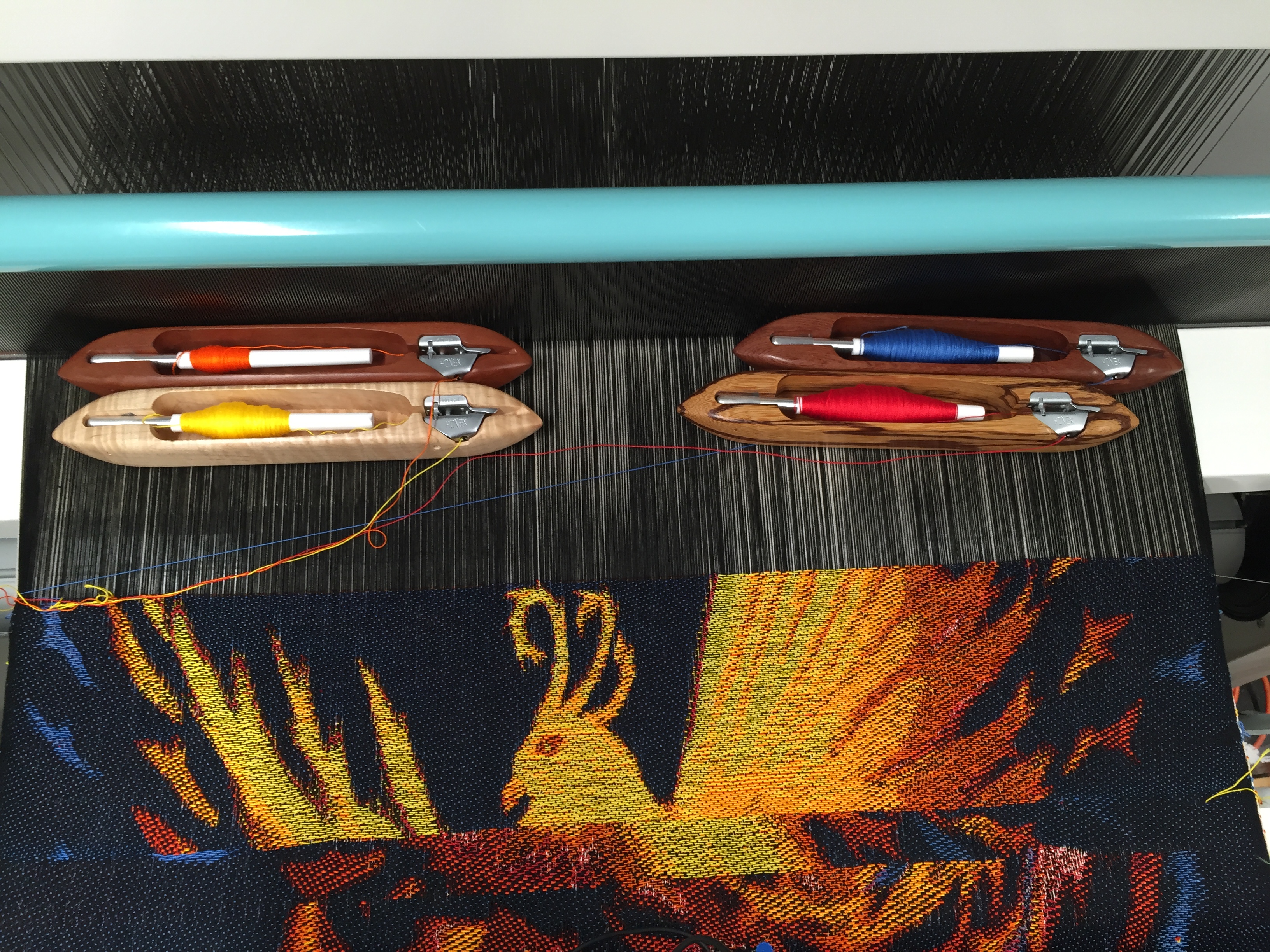
I’m planning to weave the actual piece today/tomorrow, so I hope to be able to show you the completed phoenix shortly.
Filed Under: All blog posts, textiles, weaving Tagged With: ma's memorial

December 12, 2015 by Tien Chiu Leave a Comment

Phoenix progress

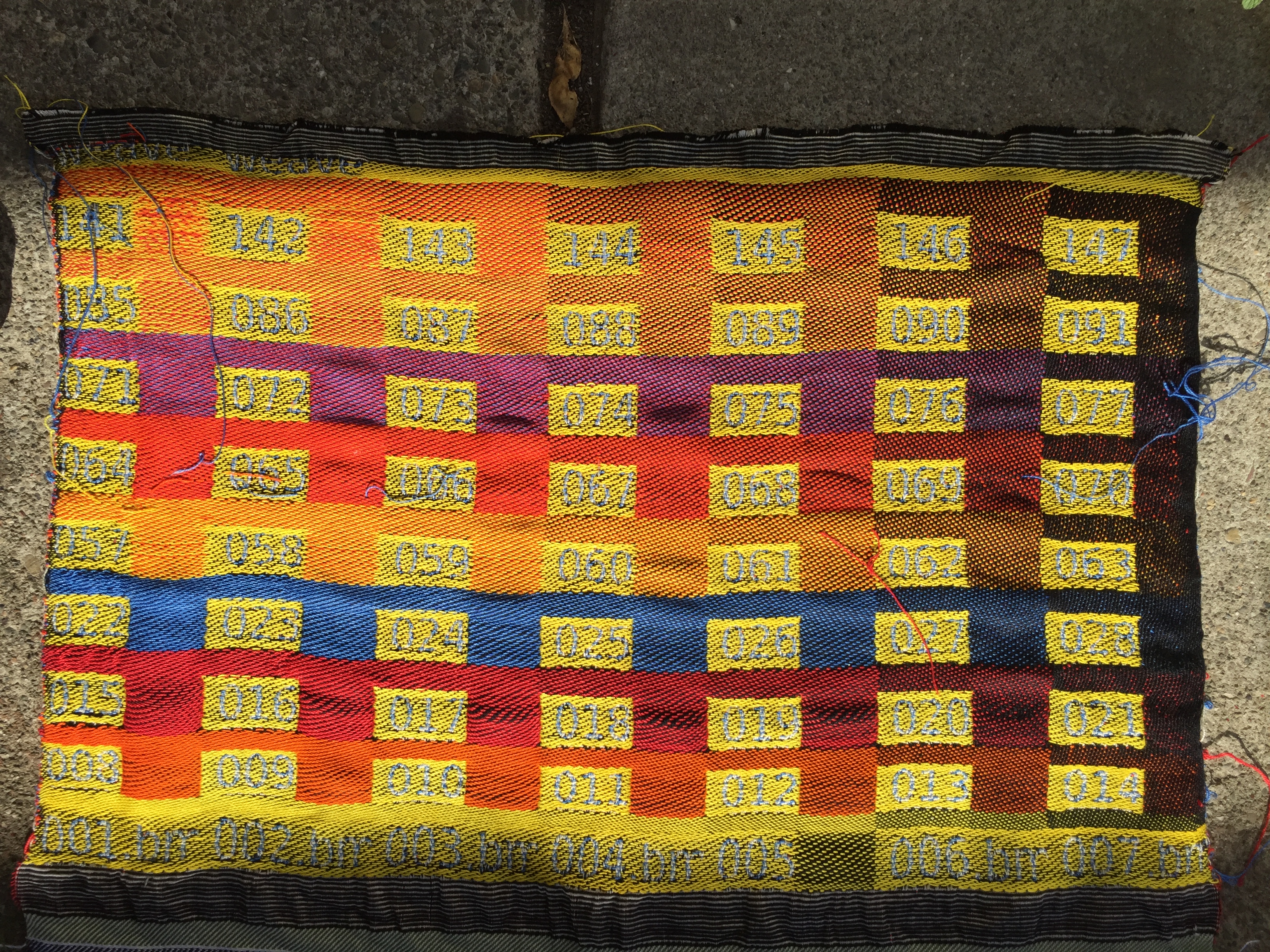
I spent most of yesterday converting the phoenix image to a loom-ready draft. I initially tried the easy path – using Arahweave’s automatic weave generator to convert the image, as Dusan suggested in the comments – but wasn’t happy with the results, so I did a more detailed conversion on my own. I started by putting together a weave blanket, sampling 63 combinations of warp and weft:

weave blanket for phoenix piece

Then I took the above photo into Photoshop, where I created a palette of swatches by using the Eyedropper Tool to sample the photo, averaging an 11 pixel radius to arrive at a consistent color. I then had Photoshop index the file to the 63 colors in the weave blanket. Finally, I took the indexed file into Arahweave and matched all 63 colors with the appropriate weave structure. I might have been able to get by with fewer colors, but the end result looks fantastic, so I’m glad I went to the effort of doing all 63 structures.

Here’s a pic of the samples I wove:

sample for phoenix piece

This sample came out quite well. I wove short pieces of several sections, checking for technical issues. In the largest section, you can see that the aspect ratio is incorrect – the phoenix head came out slightly stretched vertically. Fortunately, in Arahweave, that’s a two-second fix – just one of its wonderful features. I found and fixed one spot where I had substituted an incorrect weave structure, and a few others where the color match was slightly off. I’ve also fixed a couple of other structural issues, such as making sure the two layers of the double weave are stitched together so they don’t slip against each other.

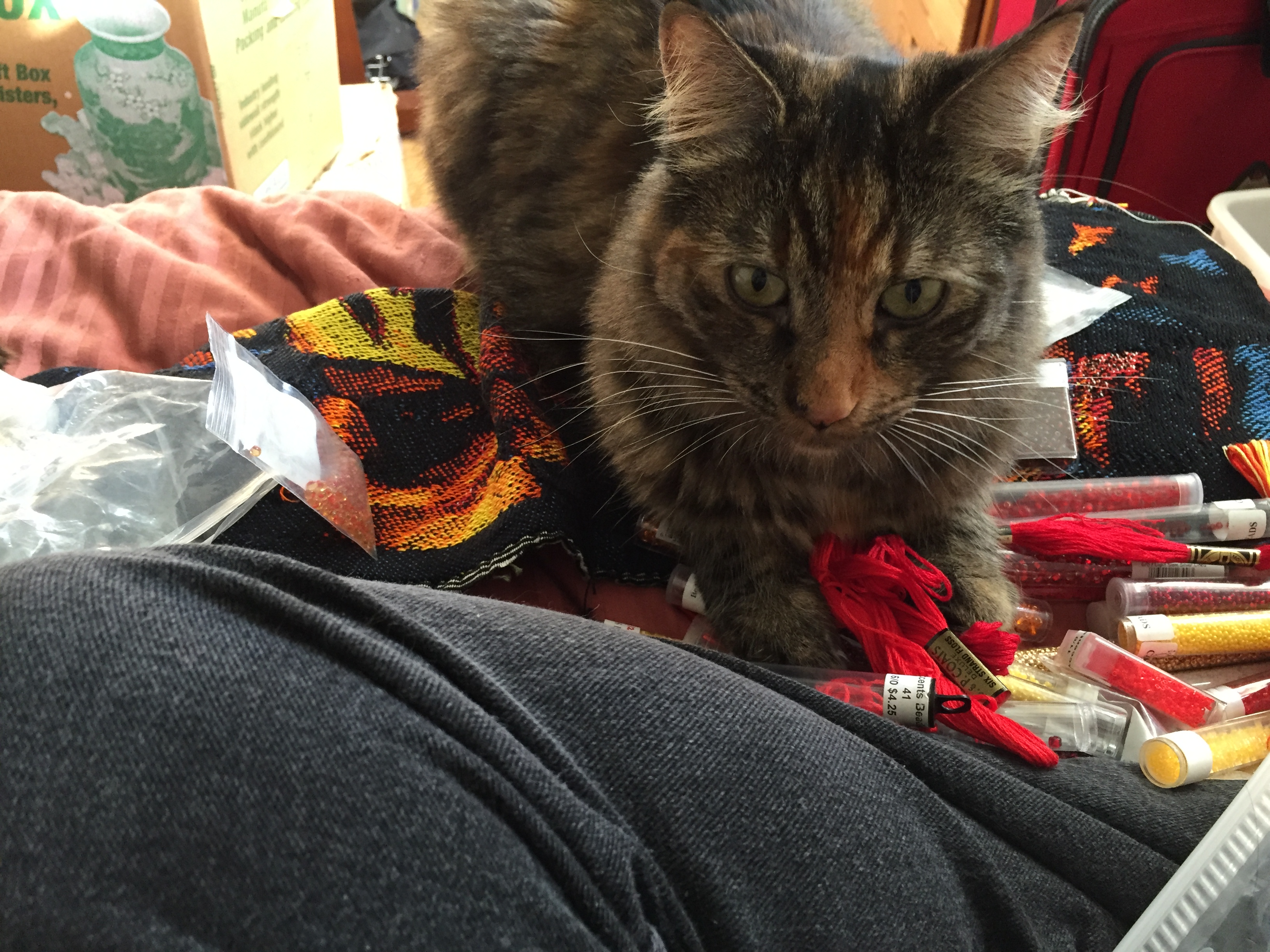
After wet-finishing and pressing the sample, I had planned to take out my mother’s beads and ribbons and experiment to see what kinds of embellishments would look good. Alas, all my best-laid plans came to naught. Here’s what the sample looked like about ten seconds after I brought out the beads.

Tigress "helping" with the embellishments
A helpful cat!

Filed Under: All blog posts, textiles, weaving Tagged With: ma's memorial

December 9, 2015 by Tien Chiu 5 Comments

Second draft of phoenix design

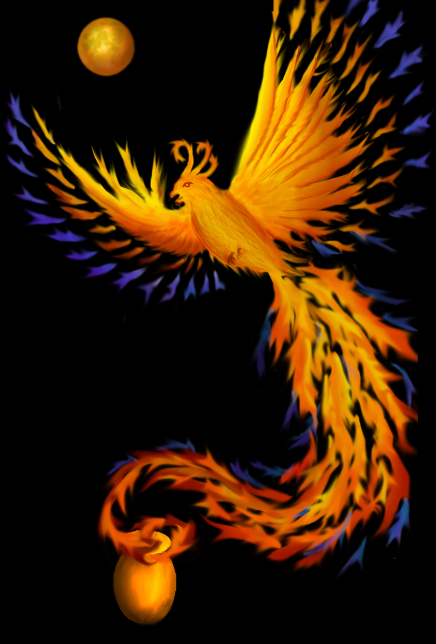
Here is the second draft of the digital painting for my mom’s memorial piece:

memorial piece for my mom - a phoenix rising from a cremation urn
memorial piece for my mom – a phoenix rising from a cremation urn

I think it’s much better than the first draft I posted a few days ago:

phoenix rising from a (not yet drawn) cremation urn
Beginnings of my mom’s memorial piece

I thought you might be interested in what I changed and why, so here is a summary of the changes.

First, I added the red-orange moon to fill in the “dead space” at top left. I put it roughly in line with the diagonal of the bird’s body and the first part of the tail, to emphasize the diagonal flow of the piece. (Had I put the moon dead center between the wings – the natural temptation – it would have disrupted the flow of the piece, as well as looking overly rigid.)

I chose to make the moon red-orange rather than white for two reasons. First, a white moon would have stuck out like a sore thumb because white appears nowhere else in the piece. It would have been visually jarring and would have drawn attention to the moon (rather than the phoenix) because of the high color contrast. Second, a white moon would either have required that I use five wefts rather than four when weaving, or else do some fancy-dancing to bring the white warp up from the bottom in just that one area. So for visual and technical design reasons, red-orange made more sense than white.

I added a tiny bit more yellow to the bottom of the bird, and (on my friend Carolyn’s suggestion) added a bit more yellow in the feathers, especially toward the end of the tail. The focal point for this piece is the bird’s head – all the elements, especially the high-contrast wings, point at the head. From the head, the line of yellow along the body draws the eye down to the tail, and the yellow and bright orange draws the eye through the tail to the cremation urn. I had originally made the urn dark brown, but Carolyn also suggested that I brighten it up and add some yellow to make it more visible. I also altered the last few feathers of the tail to make the bird appear to be rising out of the urn.

The most obvious changes are in the feathers/flames radiating out from the wing. I wasn’t satisfied with the “feel” of the original, rather jerky flames. They looked almost electric, like lightning, rather than like fire. They also clashed with the style of the rest of the piece. So I replaced them with “flames” that are stylistically very similar to the tail feathers. I had initially felt that the spacing of the feathers was too rigid, but (after playing with different spacing) decided that the very regular, formal spacing worked the best. It does two things: First, it has a peaceful, calming feel, which I thought was better suited for the piece than the more jazzy lightning effect. I wanted the idea of a spirit at peace, not an angry or overly energetic one. Second, it radiates outward, so the phoenix feels like it’s expanding. I wanted to convey the idea of a phoenix bursting forth from its physical body (the ashes) – I think these wing feathers do that very nicely.

I chose blue for the outer edges of the wing and the tail to add some color contrast. The dominant color of the piece is orange, with some yellows and reds. Blue is the complement of orange, and complementary colors tend to intensify each other. So outlining the orange in blue intensifies the orange. And because blue tends to recede while orange comes forward, the blue doesn’t distract from the orange phoenix.

Using a complementary color also adds to the energy of the piece by amping up the color contrast. Without the blue, the color scheme would be an analogous one, composed of colors adjacent on the color wheel (yellow, orange, red). Analogous color combinations are harmonious, but don’t have much visual tension. I wanted more energy in this piece. By adding a strongly contrasting hue, I increased the energy of the piece. (Try visualizing the piece without the blue – it’s much less emphatic.)

This painting is not the end of the story, of course – I will have to translate it to woven cloth and then add embellishments. An important part of the theme of this piece is the use of beads, embroidery floss, and ribbons from my mother’s stash. So I am thinking about where and how to add some of the things she left me.

I will probably continue to noodle on the image until early next week. Before I can translate the image to weave structures, I need to finish dyeing the weft yarns. Then, to get my color palette, I’ll need to create a weave blanket, photograph it, and translate it into a set of colors. That will take me a couple more days. So I don’t expect to be weaving until Monday at earliest.

Filed Under: All blog posts, textiles, weaving Tagged With: digital painting, ma's memorial

December 7, 2015 by Tien Chiu 4 Comments

Memorial piece

I’ve started work on the memorial piece for my mother. Here is the first draft of the digital painting:


phoenix rising from a (not yet drawn) cremation urn
Beginnings of my mom’s memorial piece

It is still missing some elements, like the cremation urn the phoenix is rising from. (Well, you knew it had to be phoenixes, didn’t you? Besides, a fiery bird catches the brightness of her spark a lot better than a pale white angel.) So this is not a final draft – I expect to make some more changes, especially once I get feedback from some people with more design experience.

The finished piece will not look exactly like the digital painting, of course. An image on the screen has a resolution of 72 pixels per inch and tens of thousands of colors. A woven piece will likely have only fifty shades (if that), and my warp is currently set up at 30 epi, so less than half the density. So if you try to translate a digital image directly, it will come out looking grainy and with slightly wonky colors.

Fortunately, I am not trying to “weave a picture”. Instead, I’m using the image as a loose guide for the developing cloth. Yes, the design and colors will look roughly the same. But I plan to add embellishments as well: metallic threads made with real gold, beads from my mother’s stash, embroidery, ribbons, and so on. I’m also considering using matelasse in the weave structure to make the fabric three-dimensional, giving it a “quilted” look. So the picture is only the start of the story.

This, of course, makes the design process quite complex. Do I want to weave the bird’s “body feathers” into the cloth, or embroider in the details afterwards? How can I design for the use of beads and ribbons? If I am creating a matelasse “quilted” effect, where do I put the stitch lines?

Answering the visual design questions also means answering the technical questions. Can I weave matelasse with a multicolored foreground without adding unwanted dots of a different color in the “stitched” areas? What size weft should I use, and how much will I need? What colors should I use in the weft, and how do I dye them? There are lots of technical design challenges, and they have to be answered hand in hand with the visual design questions. You cannot separate technical design from visual design – otherwise you can easily find yourself designing a piece you can’t construct. So, since I am using unfamiliar techniques, I will need to do a lot of sampling.

The plan for the next two weeks is to figure out the design and weave the cloth. I am traveling the latter half of December, so I am hoping to have the base cloth woven before I leave. That will allow me to apply some of the embellishments by hand while I’m traveling. I hope to finish the piece (at least to the point where it can be photographed) before the deadline for Convergence’s All Media exhibit. That is February 1, which makes the schedule very tight indeed.

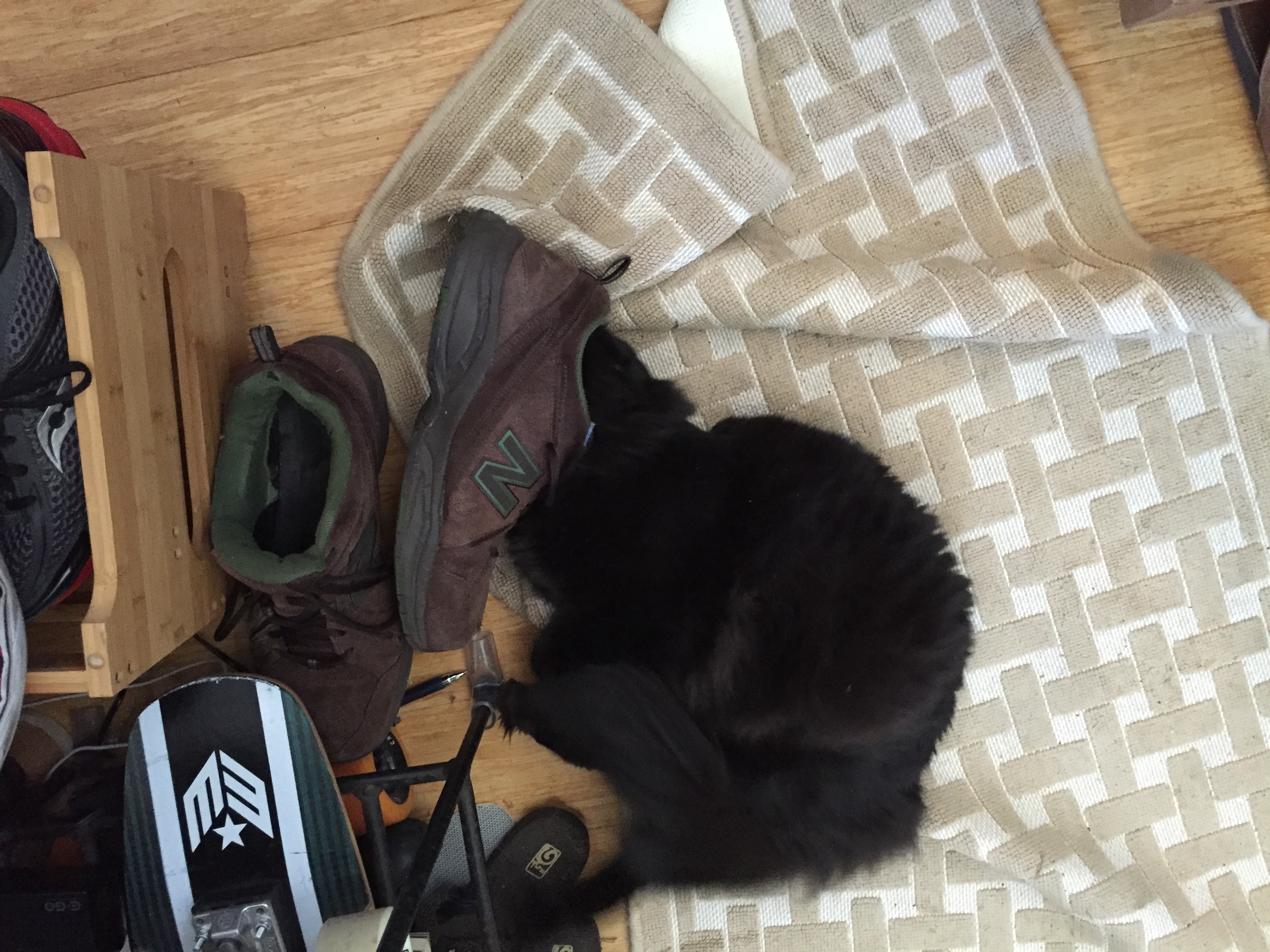
But I’m seriously excited about this project. Almost as excited as Fritz, when he’s sniffing a shoe.

Fritz sniffing a shoe
Fritz bursting with ecstasy at the fine aroma of an old shoe

Filed Under: All blog posts, textiles, weaving Tagged With: ma's memorial

  • « Previous Page
  • 1
  • 2
  • 3

Archives

Tags

aids lifecycle outfits autumn splendor book cashmere coat cats celtic braid coat color study cross dyeing design design class devore doubleweave doubleweave shawls drawing dye samples dye study group gradient colors house infinite warp jacquard loom katazome knitted blanks kodachrome jacket ma's memorial mohair coat network drafted jacket/shawl project network drafting painted warp phoenix rising phoenix rising dress phoenix rising kimono phoenix rising reloaded pre-weavolution project sea turtles taquete tie-dye tied weaves tomatoes velvet weaving drafts web design website redesign wedding wedding dress woven shibori

Categories

  • Africa
  • aids lifecycle
  • All blog posts
  • All travel posts
  • Asia
  • Bangkok
  • Belize
  • Cambodia
  • Central America
  • Chai Ya (Wat Suon Mok)
  • Chiang Mai
  • Chiang Rai (Akha)
  • China
  • chocolate
  • computer stuff
  • creating craft
  • Creative works
  • cycling
  • Delhi
  • Dharamsala
  • drawing
  • dyeing
  • Fiber Arts
  • finished
  • food
  • garden
  • Ghana
  • Guatemala
  • Hanoi
  • Ho Chi Minh City
  • Hoi An
  • India
  • Khao Lak
  • Knitting
  • knitting
  • Ko Chang
  • Laos
  • Luang Namtha
  • Luang Prabang
  • markleeville death ride
  • meditations on craft
  • mental illness
  • musings
  • Phnom Penh
  • powerlifting
  • Rewalsar (Tso Pema)
  • sewing
  • Siem Reap (Angkor Wat)
  • Southeast Asia
  • surface design
  • textiles
  • Thailand
  • travel
  • Vangvieng
  • Vientiane
  • Vietnam
  • Warp & Weave
  • Weaving
  • weaving
  • weavolution
  • writing

© Copyright 2025 Tien Chiu · All Rights Reserved ·

Loading Comments...