Tien Chiu

  • Home
  • About Tien
    • Honors, Awards, and Publications
  • Online Teaching
  • Gallery
  • Essays
  • Travels
  • Book
  • Blog
  • Dye samples
You are here: Home / Archives for devore

May 9, 2011 by Tien Chiu Leave a Comment

Cloth simulation

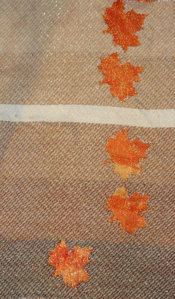
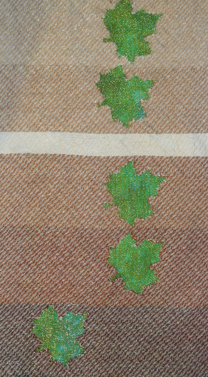
I finished dyeing my commercial-cloth samples and did a mockup today:

Falling leaves
Falling leaves

(Sorry for the angle, the photo was shot from the side and then turned in Photoshop.)

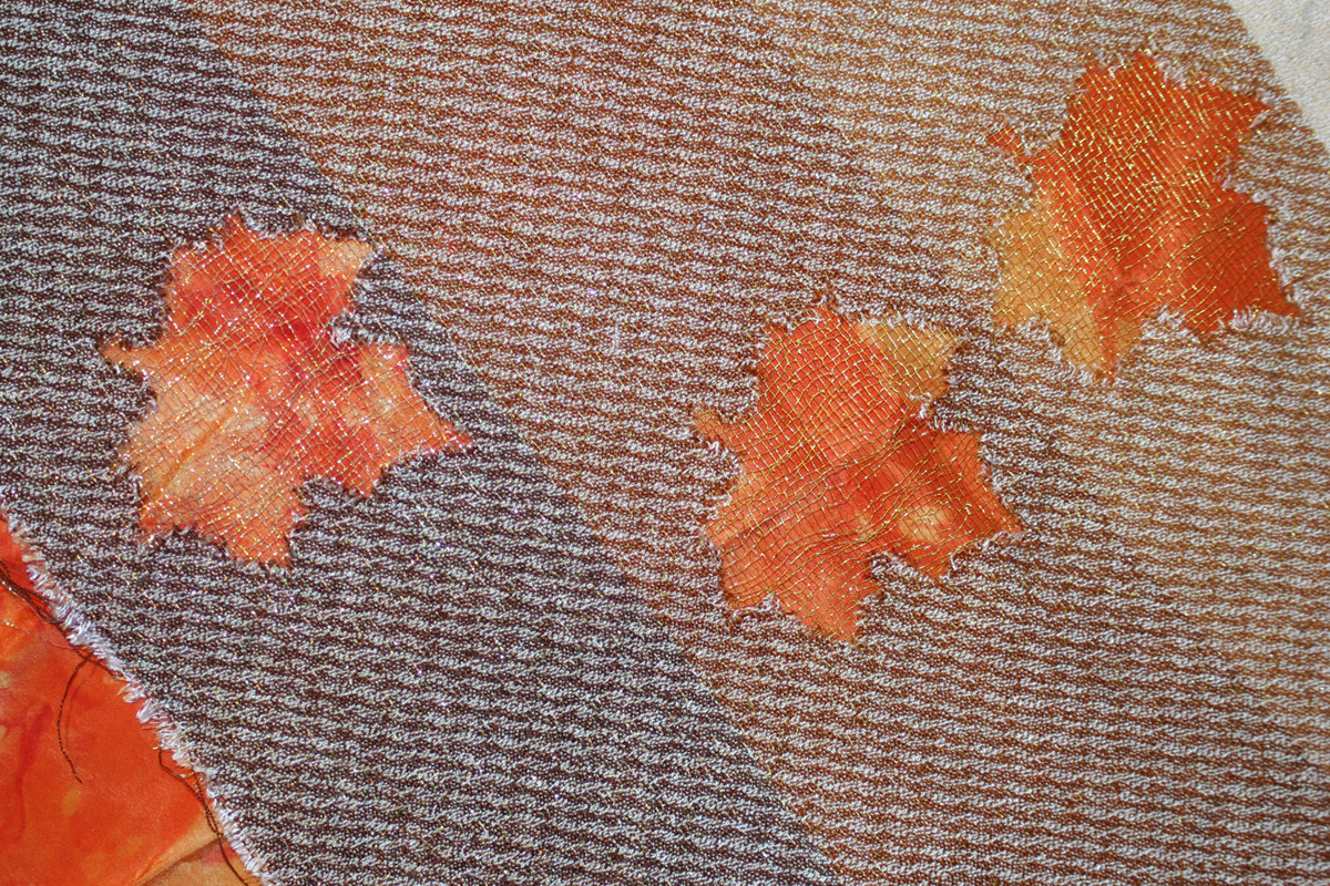
Here is the photo seen in sideways orientation (the direction from which the photo was taken):

Falling leaves, viewed from the side

I just LOVE this simulation!  Of course it looks nothing like the finished, woven, etc. fabric will, but it tells me roughly how the design plays out, which is really all I need to know right now.

And it has given me one very interesting idea…why not burn out everything EXCEPT the leaves in the top layer?  This would leave a fine gold mesh with colored leaves, drifting on top of the background fabric.  This would be more appropriate than burning out the leaf motifs, as it would give the airy, floaty feeling that I want to convey with this piece.  I love this idea a lot – the challenge will be to make that very gauzy fabric stable enough to be sewn into a garment.  Obviously you make the selvedges denser to accommodate the seams, but there may be other changes needed.  Lots more sampling needed for that!  I will probably those samples my next warp.
Filed Under: All blog posts, dyeing, textiles, weaving Tagged With: autumn splendor, devore

May 6, 2011 by Tien Chiu 1 Comment

More devore samples

I finished weaving off the warm brown set of samples:

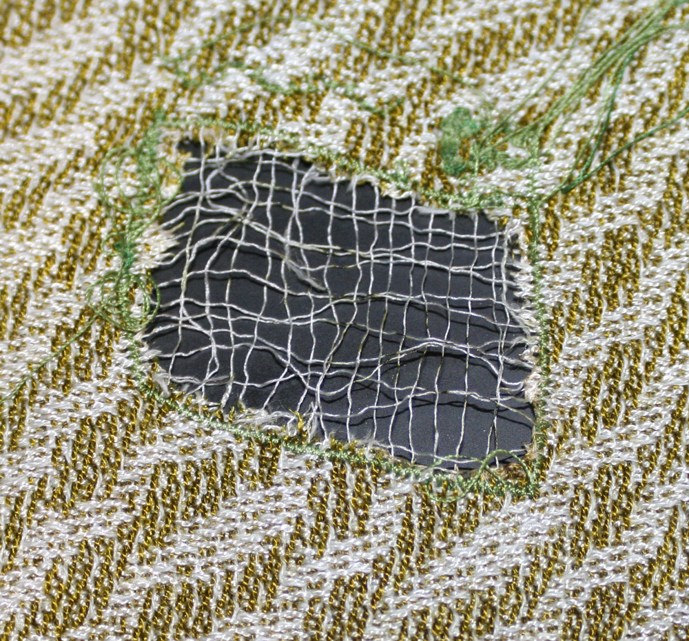
devore, various values of brown weft against a cross-dyed green background

And here it is against an hand-dyed orange background (commercial silk) that I had lying around:

devore - various values of brown weft against an orange scrunch-dyed background

And here is a good look at the metallic nylon vs. gold embroidery thread sections:

handwoven devore - metallic nylon warp/weft at left, gold embroidery thread at right

I’m still on the fence about the metallic nylon vs. gold embroidery thread.  It’s primarily a question of distance.  At a distance, the glitter of the metallic nylon (much brighter in real life) draws the eye instantly to the leaves, but up close it obscures the underlying pattern.  The gold reveals more of the cloth, and is a more appropriate color than the nylon, but has a more subtle effect.  I will have to meditate on this some more.

I am also thinking about value.  The leaves, which are medium in value, naturally stand out more when the background is either very dark or very light.  Because I want to have a feel of light in the overall piece, I think I will be making the background very light.  This means I need to make the yellow leaves somewhat darker than I normally would, so they stand out well.  It also raises the interesting question of whether the leaves should be all the same value – I will need to experiment about that.  Making the leaves progressively darker near the bottom, on a white background, will lead the viewer’s eye down.  Which I will also have to think about; normally, clothing is designed to keep the focus on the top half of the wearer, not the bottom half!

Lots of ideas buzzing around in my head!  I think probably the best way of answering them is to do a two-pronged sample set.  First, I need to work out the questions of color and value; that is best done by dyeing/burning out commercial cloth.  (Not as good as weaving up fabric, but a lot faster – I can try ten or twenty combinations in less time than it would take me to weave up one!)  Second, I need to get a final answer to my question “metallic nylon or gold embroidery thread?”  The latter is important because I am coming to the end of my 7-yard sampling warp and therefore need to decide what to put on the loom next.  I want to put on an extremely long warp with tencel and a metallic thread, which I can hopefully use both for samples and for weaving the final fabric.  But I need to decide on a metallic thread first!

So this weekend will mostly be dedicated to dyeing commercial cloth.  I may drape the rectangles of cloth on a dress form, too, to get a preliminary idea of what it will look like when sewn up and worn.

Filed Under: All blog posts, dyeing, textiles, weaving Tagged With: autumn splendor, devore

May 2, 2011 by Tien Chiu 1 Comment

I (heart) devore

Rather literally:

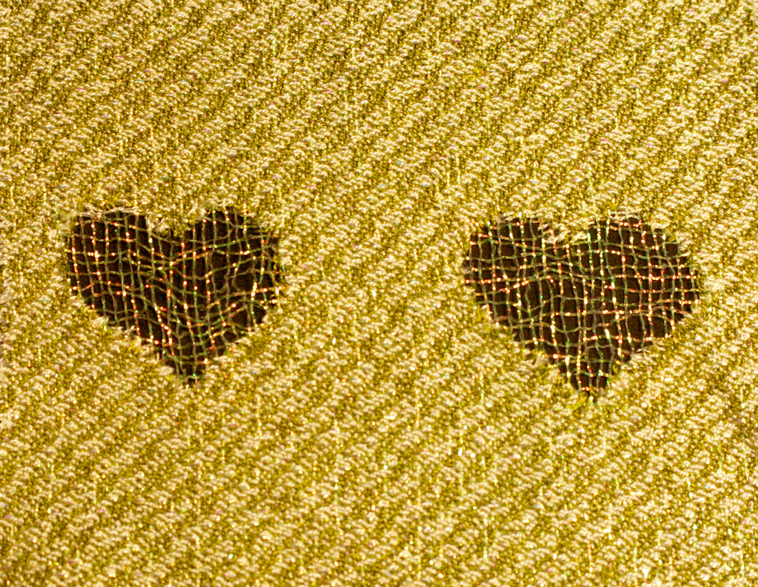
devore hearts, for the Fine Threads Study Group

These are my samples for the Fine Threads Study Group.  After I finished weaving the fabric, I silkscreened devore paste onto it in the shape of a heart, using a freezer-paper stencil to create the silkscreen.  (Which took two tries, since I had never done that before.)  Then I ironed it until the tencel turned dark and crumbly, washed it out, and presto! a beautiful plain weave grid of metallic nylon, in the shape of a heart.

I am very pleased with the results, especially since it took several days of acute frustration to get it right.  And, I’ve decided that devore is suitable for use without the machine-stitched outlines (which I thought looked tacky), though I will have to explore this a little more to make sure that larger sections of devore do not sag when hung.

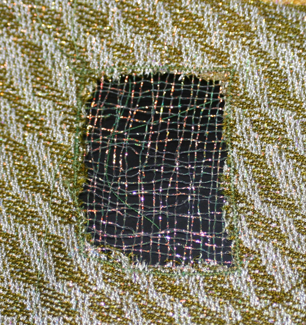
Also, thinking it over, I think the metallic gold thread might be a better choice than the metallic nylon.  The reason is this:

Devore hearts, metallic nylon against a red velvet background
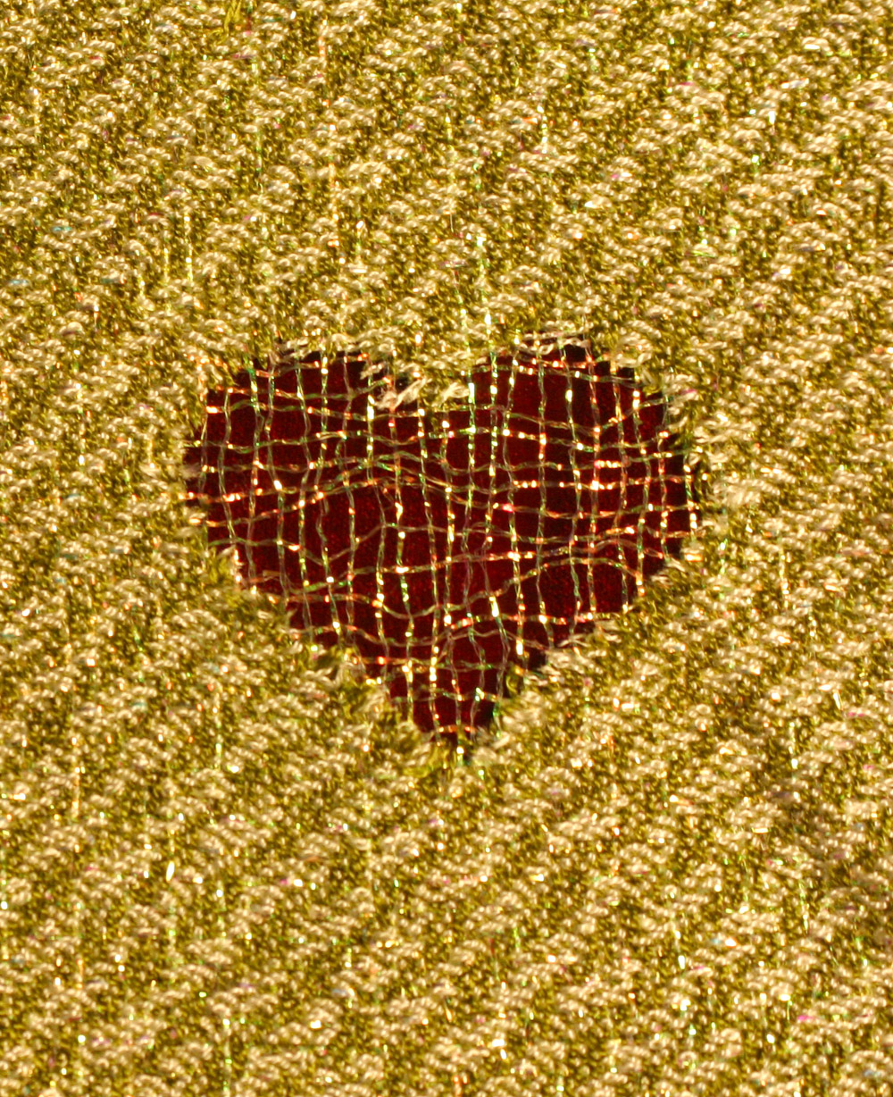
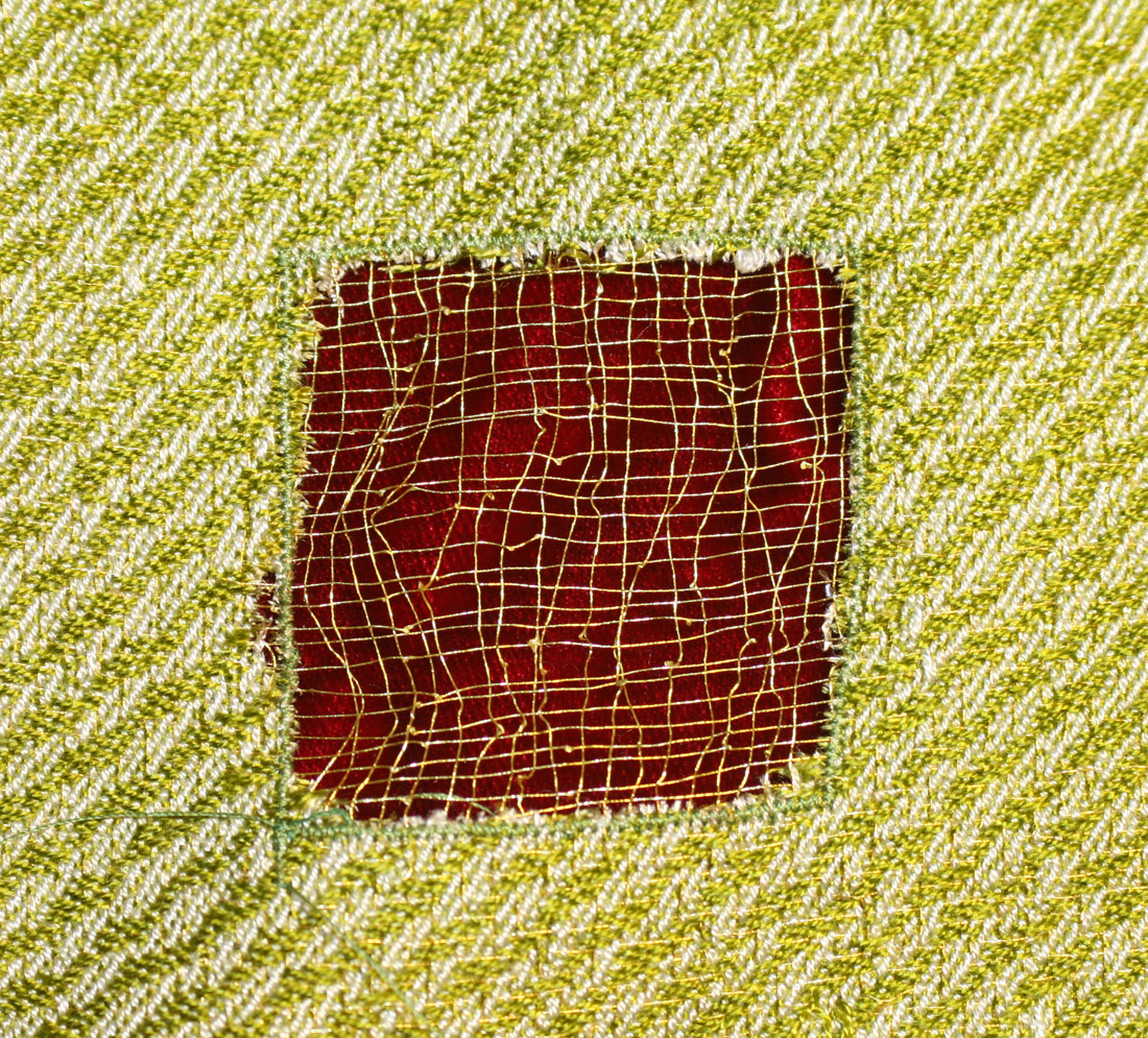
devore square, metallic gold thread against red velvet

The metallic nylon is a little too assertive/too thick; it’s hard to see the fabric underneath (especially in person – the camera doesn’t catch all the glitter).  The gold becomes a spidery web, revealing the underneath fabric clearly.  Since I want people to be looking at the underneath fabric in the devore areas, the gold is a more appropriate choice.

Since I’ve flipflopped on this before, though, I’m going to give it another day or two (and some more extensive experiments) to be sure.  I wish I had more fabric that I could cross-dye for backgrounds; I might have to dye some commercial fabric to give me the right colors to put underneath.

Next up is to weave some more samples, both to test out colors (I have 8 shades left to test) and to see what happens when I burn out larger areas.  I will probably weave some sections in gold embroidery thread and some in metallic nylon, so I can compare effects when I do larger sections of burnout.

Once I decide on colors and metallic thread, next up is also some more dye experiments, getting the transition colors from green to brown, so I can make the overall fabric shade correctly.  I will have to think carefully about my color choices, and what visual effect I’m after – if I include a section of gold, for example, it will draw the eye instantly, if the other colors are green and brown.  So I need to think about what direction(s) to take the color transitions in the background fabric, as well as what metallic threads to use for devore.

Filed Under: All blog posts, dyeing, textiles, weaving Tagged With: autumn splendor, devore

April 28, 2011 by Tien Chiu 1 Comment

Risers and sinkers

Pretty pictures first:

devore samples - iridescent nylon
devore samples - gold embroidery thread

Those two I like a lot.  The polyester, however, didn’t thrill me at all:

devore samples - polyester

I am debating whether to use the nylon or the gold embroidery thread in the finished piece.  The nylon is much brighter and more glittery (which doesn’t show up well in the photo); the gold is more understated and elegant.

Since this is for a garment, which is typically viewed from several feet away (at least!), I think I will likely use the nylon.  If I were doing a smaller piece, for example for Small Expressions, I would use the gold – it’s pretty and would be best appreciated up close.

The polyester just doesn’t have any glitz, and I feel that glitz is important for this piece.  Not necessarily loud, but there should be some sparkle.

Now, the interesting technical stuff:

Some memory floating through the back of my head said that there must be an easier way to construct these drafts, and I was right!  I went back to Alice Schlein’s blog and found the entry on risers and sinkers, changed my pattern, and was off and running!

Here is the end result:

devore draft constructed using risers and sinkers.  Yellow and green threads indicate metallic thread carryalongs, red and white indicate tencel.
devore draft constructed using risers and sinkers. Yellow and green threads indicate metallic thread carryalongs, red and white indicate tencel only.

And, since this shows no evidence of how I constructed it, here is the .psd file.

After a false start or two, I have got the weave structure and the burnout weave structure to play nicely together, so I will be weaving up the samples for the Fine Threads Study Group over the next couple of days.

Filed Under: All blog posts, textiles, weaving Tagged With: devore, photoshop

April 26, 2011 by Tien Chiu 1 Comment

One structure to another

(Warning: this is a pretty technical post.  If you aren’t interested in Photoshop construction techniques for devore, feel free to skip it.)

The previous proof-of-concept sample was interesting, but I noticed that the burnout sections were very unstable.  Partly that’s because they’re gauzy and made up of slippery threads, but partly it’s because I didn’t pay any attention to the interlacement of the burnout sections when designing the pattern.  Holly Brackmann had mentioned to me that it is possible to burn out one structure to reveal another, so that’s what I set out to do this morning.

First I constructed the devore overlay in Photoshop:

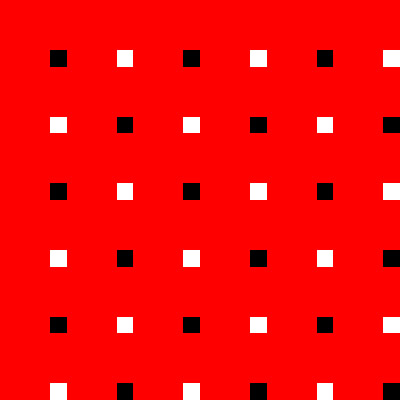
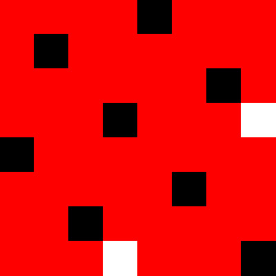
Base structure for devore

Since the metallic occurs every fourth thread, when the tencel is burned away, this pattern in the liftplan, on a straight draw threading, will result in a plain weave of metallic threads.  (Black indicates a lifted warp thread, white a lowered one.)  The remainder of the liftplan – the red sections – can be anything at all; it doesn’t matter since those threads will be burned away.

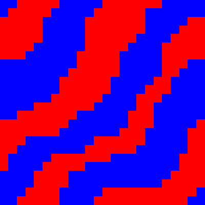
So then I set about designing the red sections.  First I came up with a basic pattern, an undulating series of lines, which would tile together gracefully:

overall pattern for devore

Now I had to construct a fill pattern that would satisfy the devore overlay requirement.  So I took an 8×8 thread section (8×8 being the repeat length for the plain weave devore), and put in the devore overlay:

devore base for pattern

Then I had to come up with a pattern that would have the black and white squares in appropriate places.  An 8-end satin happened to work:

satin satisfying devore overlay requirements
Satin satisfying devore overlay requirements. Black indicates raised warp threads, red and white indicate lowered ones.

(The red sections would later be converted to white for an 8-end, 1-7 satin.)

This would have worked fine except that I was threaded up at a sett appropriate for 4-1 twill.  If I just used the satin, the base fabric would be too sleazy.  So I added an extra interlacement to the satin:

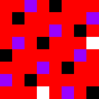
modified satin, still satisfying the devore structure requirement
modified satin, still satisfying the devore structure requirement. Purple and black squares indicate raised warp ends, white and red indicate lowered warp ends.

This gave me the required number of interlacements.  It may have other structural issues – I need to weave it up to know for sure – but it gave me a useful pattern to work with, so I went with it.

I then constructed an equivalent pattern, warp-dominant:

Warp-dominant satin.  Red and black squares indicate shafts to be lifted, white indicates shafts that stay down.
Warp-dominant satin. Red and black squares indicate shafts to be lifted, white indicates shafts that stay down.

And I filled it into my overall pattern:

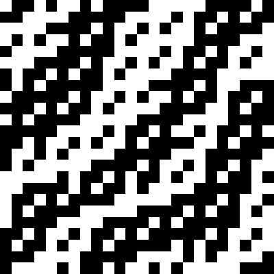
Final pattern for devore

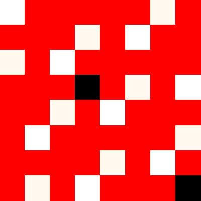
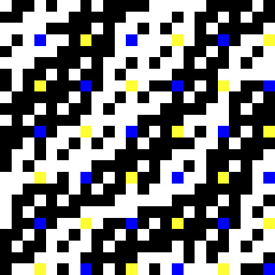
Here is the pattern with the devore overlay visible:

Devore showing overlay.  Blue squares indicate raised metallic warp ends, yellow indicate lowered ones.
Devore showing overlay. Blue squares indicate raised metallic warp ends, yellow indicate lowered ones.

There are still a few things I haven’t worked out about this pattern yet.  I’m pretty sure that my two patterns do not produce clean-cut boundaries, so there may be extra floats.  But it will do for the next set of experiments.

Not wanting to use up my laboriously dyed shades of yarn for the Fine Threads Study Group, I’ve dyed another 100g of yarn in dark green.  I’m waiting for it to finish dyeing; I’m hoping to dry it overnight and be weaving tomorrow!

Filed Under: All blog posts, textiles, weaving Tagged With: devore

  • « Previous Page
  • 1
  • 2
  • 3
  • Next Page »

Archives

Tags

aids lifecycle outfits autumn splendor book cashmere coat cats celtic braid coat color study cross dyeing design design class devore doubleweave doubleweave shawls drawing dye samples dye study group gradient colors house infinite warp jacquard loom katazome knitted blanks kodachrome jacket ma's memorial mohair coat network drafted jacket/shawl project network drafting painted warp phoenix rising phoenix rising dress phoenix rising kimono phoenix rising reloaded pre-weavolution project sea turtles taquete tie-dye tied weaves tomatoes velvet weaving drafts web design website redesign wedding wedding dress woven shibori

Categories

  • Africa
  • aids lifecycle
  • All blog posts
  • All travel posts
  • Asia
  • Bangkok
  • Belize
  • Cambodia
  • Central America
  • Chai Ya (Wat Suon Mok)
  • Chiang Mai
  • Chiang Rai (Akha)
  • China
  • chocolate
  • computer stuff
  • creating craft
  • Creative works
  • cycling
  • Delhi
  • Dharamsala
  • drawing
  • dyeing
  • Fiber Arts
  • finished
  • food
  • garden
  • Ghana
  • Guatemala
  • Hanoi
  • Ho Chi Minh City
  • Hoi An
  • India
  • Khao Lak
  • Knitting
  • knitting
  • Ko Chang
  • Laos
  • Luang Namtha
  • Luang Prabang
  • markleeville death ride
  • meditations on craft
  • mental illness
  • musings
  • Phnom Penh
  • powerlifting
  • Rewalsar (Tso Pema)
  • sewing
  • Siem Reap (Angkor Wat)
  • Southeast Asia
  • surface design
  • textiles
  • Thailand
  • travel
  • Vangvieng
  • Vientiane
  • Vietnam
  • Warp & Weave
  • weaving
  • Weaving
  • weavolution
  • writing

© Copyright 2025 Tien Chiu · All Rights Reserved ·


Loading Comments...